Publication


October 13th Webinar - "From Telephone to Multi-mode Surveys: State Case Studies and Conversations"
Date: October 13, 2020
Time: 11:30 AM Central / 12:30 PM Eastern
For years response rates for random digit dial (RDD) telephone surveys have been falling and costs of conducting these surveys have been rising. With growing concerns about sample coverage and costs, many ongoing government, academic and commercial surveys are making the transition from reliance on RDD sample frames with interviewers collecting data only by telephone to address-based sample (ABS) frames with letters mailed to residents and data collected through multiple self-administered modes including web or paper surveys.
This panel documents how this transition unfolded for three states...
- California
- Massachusetts
- Minnesota
...with ongoing surveys used to document trends in health insurance coverage, access to and affordability of healthcare. State analysts and survey experts highlight their experiences, successes and challenges faced in this transition sharing lessons learned. We encourage a conversation among panelists and the audience concerning the rewards and challenges of transitioning from RDD telephone to ABS multi-mode surveys.
Moderator
 Dr. Kathleen Call, Faculty and SHADAC Investigator
University of Minnesota School of Public Health
Panelists

Sarah Hagge, Research Scientist
Minnesota Department of Health

Todd Hughes, Director of the California Health Interview Survey (CHIS)
University of California Los Angeles

Zi Zhang, Director
Massachusetts Center for Health Information & Analysis
Slides from this webinar are also available to view and download. Please feel free to contact us at either astewart@umn.edu or shadac@umn.edu if you have any follow-up questions on the webinar content or would like to speak to a specific presenter regarding their portion of the presentation.

Blog & News

Expert Perspective: States’ Reporting of COVID-19 Health Equity Data (State Health & Value Strategies Cross-Post)
September 14, 2020:The following content is cross-posted from State Health and Value Strategies. It was first published on April 22, 2020.
Authors: Emily Zylla, Lacey Hartman & Lindsey Theis - SHADAC
Throughout the coronavirus pandemic SHADAC has been tracking which states are regularly reporting data that could help shed light on the health equity issues of this crisis. Collecting disaggregated demographic data on the impact of COVID-19 is one way to advance health equity during response efforts. We have found that all states are reporting some data on the coronavirus (COVID-19) outbreak, but the type and granularity of information varies considerably across states. In this expert perspective we provide updated interactive maps that explore the current status of all 50 states and the District of Columbia’s reporting of COVID-19 case and death data breakdowns by age, gender, race, ethnicity, and health care workers; and provide an update on the status of states’ reporting of hospitalization and testing data by demographic categories. We also highlight examples of states that are undertaking new, or additional, COVID-19 related data collection, reporting, or research activities to understand health disparities across populations. Finally, we summarize new federal guidance related to COVID-19 data reporting.
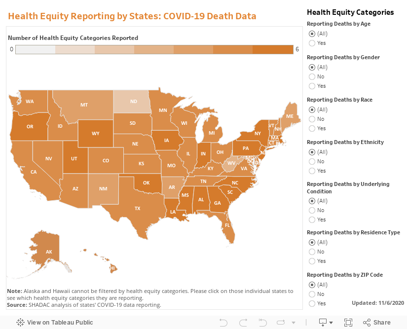
Current Status of COVID-19 Health Equity Reporting
The number of states reporting disaggregated COVID-19 case and mortality data has increased significantly since the start of the pandemic. All states now report race or ethnicity data for either COVID-19 cases or mortalities, a marked improvement from back in April when just over half (27) of states were reporting COVID-19 cases by race, and only 22 states were reporting COVID-19 deaths by race. Additionally, at the beginning of the epidemic, only three states reported information about how the distribution of cases by race/ethnicity compared to the state’s underlying population distribution. To date, 38 states are reporting their data in this way, which is helpful for understanding the extent to which COVID-19 is disproportionately impacting certain populations.
At the start of the pandemic, 13 states were reporting COVID-19 cases by residence type, and only six states were reporting deaths by residence type. Today, all states report cases by residence type, and 47 states report deaths by residence type. Similarly, the number of states reporting the number of health care workers with positive COVID-19 cases has increased from 10 to 26, and the number of states reporting COVID-19 deaths by underlying conditions has increased from 4 to 17.
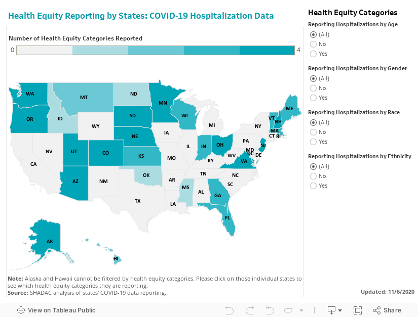
We expect that as states work to comply with the new federal reporting guidance (see below), the number of states reporting disaggregated case and testing data by various indicators will continue to increase. The number of states reporting disaggregated hospitalization and testing data, however, remains low, with just over half (26) of states reporting hospitalization data breakdowns and only eight states reporting some type of testing data breakdowns.
The maps below show how states are reporting disaggregated data for positive COVID-19 cases (Figure 1) and COVID-19 mortality data (Figure 2) and can be filtered to highlight which states are reporting by each health equity category. States marked by a darker shade of color are reporting more data breakdown categories than lighter-shaded states. Clicking on a state provides a link to each state’s data-reporting website along with more detailed information about which breakdowns a state is reporting.
Figure 1
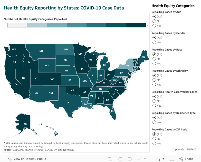
Figure 2
Hospitalizations
In our scan, we identified 26 states that are reporting hospitalization data for some subpopulations, but of those only 18 are reporting hospitalization data by race or ethnicity. (Figure 3.)
Figure 3
Testing
Our scan revealed eight states that are providing testing information by age and gender, and only five—Delaware, Illinois, Indiana, Kansas, and Nevada are also disaggregating testing data by race and ethnicity.
New COVID-19 Related Health Equity Data Activity
In addition to the newly required demographic data required above, several states are exploring, or beginning to report, additional data. For example:
· On September 8th, California became the first state in the nation to require the collection of sexual orientation and gender identity data for all COVID-19 patients.
· Pennsylvania announced it will work with a new data collection platform to collect sexual orientation and gender identity data.
· Minnesota is reporting language needs for positive cases interviewed and language by county of residence
· Massachusetts signed into law an act addressing COVID-19 data collection, requiring the Department of Public Health to compile, collect, and report several demographic factors, including whether an individual hospitalized speaks English as a second language.
A number of states have also formed health equity task forces, several of which are charged with looking at what additional data could be collected and reported. For example:
Colorado: A COVID-19 Health Equity Response Team, headed by the Office of Health Equity, was formed to look at inequities and ways to prevent gaps from widening during the pandemic. One of the Response Team’s tasks is to ensure racial and ethnicity COVID-19 data are accessible, transparent and used in decision-making.
Indiana: A legislative task force, led by the Indiana Black Legislative Caucus and in collaboration with the Interagency State Council on Black and Minority Health, the Indiana State Department of Health Office of Minority Health, and the Indiana Minority Health Coalition, was charged with studying racial disparities in health care and health care outcomes as it relates to COVID-19. The Task Force recommended the collection, stratification, analysis and reporting of race, ethnicity and preferred language data; and recommended action plans and annual reports of race, ethnicity, and preferred language outcomes.
Louisiana: A COVID-19 Health Equity Task Force examined how health inequities are affecting communities that are most impacted by the coronavirus. The Task Force’s Subcommittee on COVID-19 Data and Analysis made several recommendations in its report, including: establishing standardized protocols to ensure that information is consistently collected across the multiple testing sites, especially those pertaining to racial and ethnic identity; ensuring data collection occurs in collaboration with trusted organizations, e.g. tribal organizations and faith-based organizations or nonprofits within the Asian community; creating a data warehouse where harmonized data can be easily extracted for analysis; and allocating resources allocated to the Louisiana Department of Health to accomplish these goals.
Michigan: The Michigan Coronavirus Task Force on Racial Disparities serves as an advisory board within the state's Department of Health and Human Services. Among several charges, the Task Force will: study racial disparities of COVID-19 in Michigan and recommend action to overcome the disparities; recommend actions to increase transparency in reporting data regarding the racial and ethnic impact of COVID-19 and remove barriers to accessing physical and mental health services; and ensure stakeholders are informed, educated, and empowered with information on the racial disparities of COVID-19.
New Hampshire: The Governor’s COVID-19 Equity Response Team was charged with developing a recommended strategy to address the disproportionate impacts of the COVID-19 pandemic. Initial recommendations included: Adopting and following best practices (outlined in the report) for equitable data collection, analysis, dissemination, and utilization; dedicating staff with specific expertise in equitable data best-practice methodologies; and developing internal protocols that require the use of a vetted and approved Equity Review Tool analysis for all programmatic and policy work.
Ohio: The Minority Health Strike Force was charged with addressing the disproportionate impact of COVID-19 on minority populations in the state. The strike force was comprised of four subcommittees: data and research; education and outreach; health care; and resources. The groups’ Blueprint report included data-specific recommendations to improve data collection and reporting, have state agencies develop dashboards to monitor inequities and disparities, and consider the need for sufficient samples to identify disparities in groups with small population sizes. The Governor’s subsequent Executive Response included a commitment to: collect state-level health care quality information stratified by race, ethnicity, and language data; identify the contributing and confounding factor affecting the health disparities; identify and targeting the resources where interventions may be best applied; adopt of standards by state agencies to achieve a normalized set of data that uses the same categorization scheme; and establish evaluation criteria of impacts to inform policy.
Pennsylvania: The Pennsylvania COVID-19 Response Task Force on Health Disparity is charged with identifying obstacles that cause disparity for marginalized populations. The group collaborated with community members, stakeholders, and legislators to send recommendations to the Governor for addressing issues related to a higher incidence of COVID-19 among minorities. The group recommended instituting a statewide standard around racial/ethnic data collection that mirrors the standards in the Affordable Care Act, and disaggregating Asian health data.
Tennessee: The Tennessee Department of Health, Office of Minority Health, launched a statewide Health Disparities Task Force to: examine existing data, monitor trends, and hear from those living, working and serving Tennessee communities to generate responsive solutions and policies to reduce health disparities.
Vermont: A Racial Equity Task Force will undertake projects designed to promote racial, ethnic and cultural equity, including evaluating structures of support for racially diverse populations, including a focus on the racial disparities in health outcomes highlighted by COVID-19. It will submit recommendations to the Governor on the COVID-19 project by August 15.
CARES Act Reporting Requirements
In March 2020 Congress passed, and the President signed, the Coronavirus Aid, Relief, and Economic Security (CARES) Act. The statute required “every laboratory that performs or analyzes a test that is intended to detect SARSCoV-2 or to diagnose a possible case of COVID-19” to report the results from each such test to the Secretary of the Department of Health and Human Services (HHS), and authorized HHS to prescribe the form and manner of such reporting. On June 4, HHS released new guidance outlining the data elements required for reporting, which included, among other elements:
· Patient age
· Patient race
· Patient ethnicity
· Patient sex
· Patient residence zip code
· Patient residence county
· If the patient is employed in health care
· Is the patient a resident in a congregate care setting (including nursing homes, residential care for people with intellectual
and developmental disabilities, psychiatric treatment facilities, group homes, board and care homes, homeless shelter,
foster care or other)
· If the patient is hospitalized
· If the patient is pregnant
The guidance also indicates that additional data elements may be requested by state, local, or federal health departments at any time. If required data elements are not available, providers, laboratories and public health departments are encouraged to leverage resources like state, regional, or national Health Information Exchanges or Networks to obtain missing, required information. Reporting of these data elements must begin no later than August 1, 2020. While this guidance applies to all laboratories, it does not require states or local public health departments to report COVID-19 mortality data by any specific demographic breakdowns.
Publication
50-State Analysis of Drug Overdose Trends: The Evolving Opioid Crisis Across the States (Infographics)
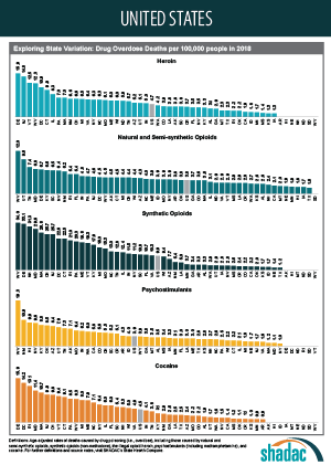
This set of two-page infographics uses estimates from SHADAC’s State Health Compare online data tool to explore the evolving opioid overdose epidemic across all 50 states and the District of Columbia, examining state variation in both the prevalence of opioid deaths and the types of opioids associated with these deaths. Additionally, due to growing concern and evidence that the opioid crisis may be expanding to other non-opioid illicit drugs, we have included data on drug overdose deaths from two types of drugs that are commonly involved in opioid overdoses: cocaine and psychostimulants, such as methamphetamine.
The infographics highlight key findings for trends in drug overdose deaths from 2000-2018, show how each state's overdose rates compare to the national average, and provide a high-level comparison of all 50 states' overdose death rates broken down by each of the five drug types.
Click on a state below to see its two-page infographic or download all state's infographics here.

Explore the drug overdose death data further on State Health Compare.
Further Reading and Resources
The Opioid Epidemic in the United States
SHADAC Resource, March 2020 (Updated)
The Evolving Opioid Epidemic: Observing the Changes in the Opioid Crisis through State-level Data
SHADAC Webinar, September 2019
The Opioid Epidemic: National and State Trends in Opioid-Related Overdose Deaths from 2000 to 2017
SHADAC Briefs, June 2019
Archive: 2000-2017 Evolving Opioid Crisis Infographics
SHADAC Infographics, February 2019
Blog & News
50-State Infographics Provide an Updated Overview of the Evolving Opioid Crisis
July 15, 2020:Though still in the midst of the coronavirus pandemic, the United States continues to grapple with other national public health emergencies, such as the opioid crisis. Indeed, many public health experts have voiced concerns about the potential effects of COVID-19 on mental health and associated issues, including the rates of suicide deaths, alcohol-related deaths, and opioid and related drug overdose deaths, commonly referred to as “deaths of despair.”
SHADAC researchers have been researching these topics using vital statistics data, recently publishing an analysis of national and state suicide death rates, as well as producing this set of updated two-page infographics focused on opioid and opioid-related drug overdose deaths using the latest annual data for all 50 states and the District of Columbia. SHADAC also makes all of the 2018 data used in those infographics publicly available through our State Health Compare online data tool.*
Click on a state below to see its two-page infographic or download all state's infographics here.
HIGHLIGHTS
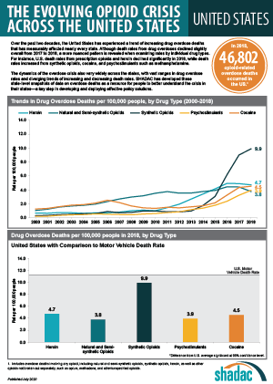
Background: U.S. trends in drug overdose deaths
As data have increasingly shown, the opioid crisis has continued to evolve beyond just the different classes of opioids—such as natural and semi-synthetic opioids, synthetic opioids, and heroin—to include two types of non-opioid illicit drugs that have commonly been reported in combination with opioid overdoses: cocaine and psychostimulants (such as methamphetamine).
From 2000 to approximately 2011, the growth in opioid overdose deaths was driven primarily by natural and semi-synthetic opioids (i.e., prescription opioid painkillers); but that death rate has since largely plateaued. Beginning around 2011, deaths from heroin began to increase more rapidly, but reached their own plateau in 2015. Since around 2013, it is deaths from synthetic opioids (such as fentanyl) that have experienced the largest increases—a trend that continued in 2018, with the national rate from this drug category (9.9 deaths per 100,000 people) registering nearly three times as high as natural and semi-synthetic opioids (3.8 per 100,000 people) and almost double that of heroin (4.7 per 100,000 people).
Around the same time that death rates from heroin and synthetic opioids began to increase, deaths from cocaine and psychostimulants (e.g., methamphetamine) also began to rise; due in part, evidence has strongly suggested, to deaths involving multiple drugs.1 In 2018, overdose death rates for both drugs reached new highs at 4.5 per 100,000 people for cocaine and 3.9 per 100,000 people for psychostimulants.
State variation in overdose deaths
While it is important to understand the national toll of the crisis, the story at the state level shows the dynamics of this public health crisis can vary widely, both in the prevalence of overdose deaths and the types of drugs associated with those deaths.
Opioid Overdose Deaths
Although most states have experienced measurable increases in opioid overdose deaths between 2017 and 2018, the scale of the crisis has seen wide variation. For example, while the rate for the state with the number of deaths from synthetic opioids in 2018, West Virginia, decreased from 37.4 per 100,000 people in 2017 to 34.0 per 100,000 in 2018, this rate was still nearly 30 times the rate of the lowest state, Texas (1.2 deaths per 100,000 people).
The types of opioids most commonly associated with overdoses can also vary across states. For example, as in 2017, Utah had the second-highest rate of deaths from natural and semi-synthetic opioids in 2018, at 9.6 deaths per 100,000 people; however, contrary to the U.S. trajectory, the state’s rate of deaths from synthetic opioids remained relatively steady, at 3.1 per 100,000 people in 2017 and 2.9 per 100,000 in 2018—well below the U.S. rate of 9.9 per 100,000 people (up significantly from 9.0 per 100,000 in 2017).
Overdose Deaths from Cocaine and Psychostimulants
The scale of overdose deaths from non-opioid illicit drugs also varies widely across states. For example, the 2018 overdose death rate from cocaine was highest in Delaware at 15.9 per 100,000; the state jumped four places to overtake the District of Columbia (17.6 deaths per 100,000 people in 2017), and Delaware’s rate was 17 times that of Arkansas and Minnesota (0.9 deaths per 100,000 people).
In 2018, the state with the highest overdose death rate from psychostimulants was again West Virginia at 19.3 per 100,000 people, a significant increase from 13.6 deaths per 100,000 people in 2017; West Virginia’s rate was more than 19 times the rate of 1.0 deaths per 100,000 people in New York.
Regional Patterns in Drug Overdose Death Rates
Despite the evidence of state variation in drug overdose death rates, further analysis illustrates some broader patterns across regions that have remained fairly consistent between 2017 and 2018:
Heroin and synthetic opioids
Death rates from heroin and synthetic opioids are generally higher east of the Mississippi River, particularly among states in the Northeast, the Appalachian region, and the industrial Midwest.
Natural and semi-synthetic opioids
Higher death rates from natural and semi-synthetic opioids are more geographically dispersed than those from heroin and synthetic opioids. While some eastern U.S. states have particularly high rates of deaths from natural and semi-synthetic opioids (e.g., Maryland, Tennessee, and West Virginia), there are other states in the western U.S. that also have similarly high death rates from these drugs (e.g., Utah, New Mexico, and Nevada).
Cocaine
An examination of cocaine death rates reveals a pattern similar to that of death rates from heroin and synthetic opioids, with states east of the Mississippi River exhibiting higher rates of cocaine overdose deaths.
Psychostimulants
Death rate patterns from psychostimulants appear to be almost the opposite of those for heroin and synthetic opioids, with relatively low death rates in the Northeast and particularly high rates of deaths in the western U.S. and the Southeast. Only two states—Kentucky and West Virginia—show strong overlaps between psychostimulant and heroin and synthetic opioid deaths.
Conclusion
Some early data from the CDC show encouraging signs that progress is being made in the fight against opioids, with the national drug overdose rate declining from 2017 to 20182; however, examining trends at the state level show a more nuanced picture. While improvements have been found in key states such as Ohio, which saw significant decreases in nearly every drug category (heroin, natural and semi-synthetic opioids, synthetic opioids, and cocaine) from 2017 to 2018, other states such as Delaware have seen historic increases in their rates of overdose deaths from synthetic opioids, heroin, and cocaine (the state now ranks highest among all 50 states in the latter two drug categories) for this same time period. Because of the opioid crisis’s history of evolving and changing, it will be important to continue monitoring data on drug overdoses to track whether death rates continue to decline or experience a resurgence—possibly driven by new drugs.
Explore the drug overdose death data further on State Health Compare.
Further Reading and Resources
The Opioid Epidemic in the United States
SHADAC Resource, March 2020 (Updated)
The Evolving Opioid Epidemic: Observing the Changes in the Opioid Crisis through State-level Data
SHADAC Webinar, September 2019
The Opioid Epidemic: National and State Trends in Opioid-Related Overdose Deaths from 2000 to 2017
SHADAC Briefs, June 2019
1 Kariisa, M., Scholl, L., Wilson, N., Seth, P., & Hoots, B. (2019, May 3). Drug overdose deaths involving cocaine and psychostimulants with abuse potential—United States, 2003-2017. MMWR, 68(17), 388-395. DOI: http://dx.doi.org/10.15585/mmwr.mm6817a3
Drug Enforcement Administration (DEA) Strategic Intelligence Section. (2020). 2019 National Drug Threat Assessment [DEA-DCT-DIR-007-20]. Retrieved from https://www.dea.gov/sites/default/files/2020-01/2019-NDTA-final-01-14-2020_Low_Web-DIR-007-20_2019.pdf
Insufficient evidence exists as to whether the pattern of non-opioid illicit substances is driven primarily by unintentional contamination (e.g., drug traffickers accidentally mixing fentanyl into cocaine due to sloppy packaging) or intentional mixing of different drug types (e.g., drug traffickers purposefully blending methamphetamine and fentanyl into counterfeit prescription pills).
2 Hedegaard, H., Miniño, A.M., & Warner, M. (2020). Drug overdose deaths in the United States, 1999-2018 [Data brief No. 356]. Retrieved from https://www.cdc.gov/nchs/data/databriefs/db356-h.pdf
Blog & News
U.S. Suicide Death Rate Reached Record High in 2018: SHADAC Briefs Examine the Numbers among Subgroups and States
June 16, 2020:The suicide death rate for the United States reached another historic high in 2018, rising to 14.2 deaths per 100,000 people from 14.0 in 2017, according to new vital statistics data from the U.S. Centers for Disease Control and Prevention (CDC). This newest jump continues a decades-long increase in death rates from suicide in the U.S.—a trend that predates the current COVID-19 pandemic, which early evidence indicates is taking a significant toll on mental health.
According to a recent national poll by the Kaiser Family Foundation, more than half of respondents (56%) reported that worry or stress related to the pandemic has led to at least one negative effect on their mental health, such as trouble sleeping or eating, increased alcohol use, or worsening chronic conditions. While experts will look to suicide rates as one important indicator of the mental health impact of COVID-19, data on suicide deaths for the current period will not be available until next year at the earliest. In the meantime, new data from 2018, estimates of which can be found on the SHADAC State Health Compare web tool, provide an updated baseline to help understand potential changes during COVID-19.
 Two new SHADAC briefs draw on this data to present trends and variations in suicide death rates across the nation, among the states, and by subpopulation breakdowns from 2000 to 2018. The briefs paint a picture of the current landscape of suicide deaths—highlighting geographic areas and demographic groups that warrant particular attention as mental health stressors increase nationwide.
The first brief looks at national trends and demographics in suicide deaths, and the second brief looks at state trends and variations. Below are highlighted findings from the two briefs.
National Trends and Demographics in Suicide Death Rates from 2000 to 2018
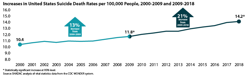
The 2018 U.S. suicide death rate of 14.2 per 100,000 people represents a 37% increase from the 2000 rate of 10.4 deaths per 100,000 people—an additional 3.8 deaths per 100,000 people per year. This increase represents about 110,000 more lives lost than if the U.S. suicide rate had remained steady.
The increase in suicide deaths has not followed a consistent trend; rather, growth has accelerated more recently. From 2000 to 2009 the suicide death rate grew by 13 percent, but from 2009 to 2018 the rate grew by 21 percent.
Suicide Deaths by Age
- In 2018, children age 10-14 had the lowest suicide rate, at 2.9 per 100,000. This was the only rate we examined that was lower than the overall rate of 14.8 per 100,000.1 However, this age group experienced the largest increase in suicide rates from 2000 to 2018, at 95 percent.
- Adults age 55-64 had the highest suicide death rate in 2018, at 20.2 per 100,000.
Suicide Deaths by Sex
- In 2018, the suicide rate for males was 22.8 per 100,000, while the suicide rate for females was 6.2 per 100,000. However, the suicide rate increased more for females (56 percent) than for males (28 percent) from 2000 to 2018.
Suicide Deaths by Race/Ethnicity
- In 2018, American Indians and Alaska Natives had the highest suicide death rate at 22.1 per 100,000 people, significantly higher than the overall population rate of 14.2 per 100,000. Whites had the second-highest rate at 18.0 per 100,000, which was also significantly higher than the overall rate.
- Asians and Pacific Islanders, Blacks, and Hispanics registered similar rates of suicide death in 2018 (7.0, 7.2, and 7.4 per 100,000, respectively), all of which were significantly lower than the overall population rate.
- Rates of death from suicide have increased significantly across all races and ethnicities from 2000 to 2018. However, suicide death rates increased more rapidly among American Indians and Alaska Natives than among other groups, with American Indians and Alaska Natives seeing an 86 percent increase in suicide deaths since 2000.
For further analysis, including an examination of suicide death rates by urbanization and cause of death (i.e., firearm vs. non-firearm), see the full SHADAC issue brief on suicide rates at the national level.
State Trends and Variation in Suicide Death Rates from 2000 to 2018
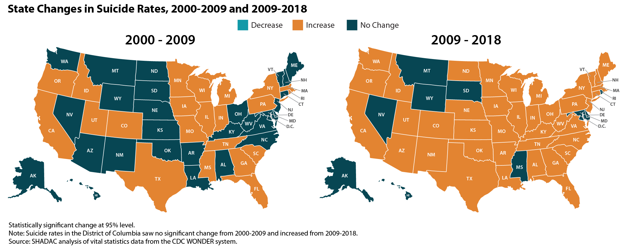
State-level trends in suicide death rates suggested a pattern of acceleration similar to the national one described above: From 2000 to 2009, 22 states experienced statistically significant increases in their suicide rates, whereas from 2009 to 2018, 41 states experienced significant increases.
State Variation
 41 states and the District of Columbia experienced significant increases in suicide death rates between 2000 and 2018. Increases ranged from a low of 14 percent in Maryland, where rates grew from 9.0 to 10.2 suicide deaths per 100,000 people, to a high of 97 percent in the District of Columbia, where rates grew from 3.8 to 7.5 deaths per 100,000.2
- Wyoming had the highest 2018 suicide rate at 25.2 deaths per 100,000 people, and the District of Columbia had the lowest rate at 7.5 deaths per 100,000 people.
- Twelve states and the District of Columbia had suicide death rates in 2018 that were significantly lower than the overall U.S. rate (14.2 deaths per 100,000 people), 9 had rates that were statistically equivalent to the U.S. rate, and 29 had rates that were significantly higher than the U.S. rate.
For further analysis, including an examination of state-level suicide death rates by cause of death, see the full SHADAC issue brief on suicide rates at the state level.
About the Data
SHADAC accesses vital statistics data from the Centers for Disease Control and Prevention, National Center for Health Statistics, via the CDC WONDER Database.
Except where otherwise indicated, rates of suicide deaths presented here are age-adjusted. Rates and standard errors were obtained from the CDC Wonder Database using ICD-10 cause-of-death codes U03 (Suicide terrorism); X60-X84 (Intentional self-harm); and Y87.0 (Sequelae of intentional self-harm).
Explore the Data
Suicide death rate data from the CDC WONDER Database can be accessed on SHADAC’s State Health Compare data tool. Data are available for the years 1999 to 2018 for the U.S. and all 50 states and the District of Columbia, and can be analyzed by age, sex, race/ethnicity, metropolitan status, and firearm vs. non-firearm cause of death.
Related Research
Like the Kaiser Family Foundation (KFF), SHADAC recently fielded a survey that asked a nationally representative sample of U.S. adults about changes in their stress levels in response to the COVID-19 pandemic as well as how they were coping with coronavirus-related stress. Results from the survey echoed the troubling findings from KFF, with over 90% of respondents reporting increased stress levels, and nearly 74% correspondingly reporting increased use of coping mechanisms in response to rising stress—including those with negative consequences, such as eating more (and more unhealthy foods) and increased alcohol consumption, smoking, and vaping.
1 When analyzing suicide rates by age groups, the rates cannot be age-adjusted as for other portions of this analysis. Because of that, we use an overall U.S. suicide rate that is not age-adjusted when analyzing age groups, so that rate varies slightly from the rate presented elsewhere in this analysis.
2 Although the District of Columbia’s suicide rates are relatively low compared to other states, its suicide death rates also are relatively volatile year-to-year. For example, its suicide death increased about 70 percent from 2000 to 2001, whereas its rate decreased about 40 percent from 2008 to 2009.