Blog & News


Neighborhood Support Matters for Child Health
November 22, 2022:Where people live, work, and play has been shown to have important impacts on health. In addition to one’s physical environment (e.g., access to safe schools, parks, and sources of nutritious food), the extent to which people feel connected to a supportive community with a network of resources is an important factor for health. This concept is known as “social capital," and has been linked with a broad range of health outcomes including mortality.
Neighborhood support is a form of social capital that can be measured with available survey data. The National Survey of Children’s Health (NSCH) is nationally representative and includes children (age 0-17) in all 50 states and the District of Columbia. The data from this survey provide information on family perceptions of neighborhood support and a broad range of child sociodemographic and health characteristics. NSCH data also allow researchers to study the association between supportive neighborhoods and key children’s health outcomes.
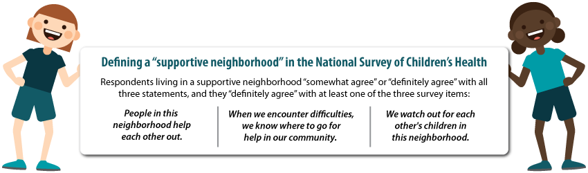
Only about half (55%) of children lived in a supportive neighborhood. As shown in the figure below, the likelihood of living in a supportive neighborhood also varied across population subgroups. Perceived neighborhood support was less likely for non-English households, children of color, children with special health care needs (CSHCN), families with less education or income, and children with public health insurance coverage or who were uninsured.
Percent of children living in supportive neighborhoods, by child characteristics
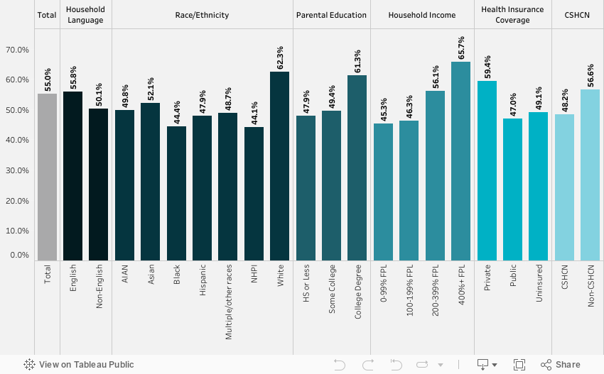
Source: SHADAC analysis of the National Survey of Children’s Health, 2018-2019
We found that neighborhood support matters for a child’s health. Family perceptions of neighborhood support were significantly associated with four of the five outcomes we examined, after adjusting for child characteristics. Children in supportive neighborhoods were less likely to have a past year emergency department visit or unmet care needs and were more likely to have a preventive dental visit and better parent-reported oral health status (Table below).
| Past year ED visit odds ratio | Unmet health needs odds ratio | Preventive dental visit odds ratio | Fair/poor health odds ratio | Fair/poor oral health odds ratio | |
| Neighborhood support | 0.89* | 0.52*** | 1.16** | 0.72 | 0.65*** |
Notes: *** p<0.001, ** p<0.01, * p<0.05 Unmet health care needs included medical, dental, hearing, vision, or mental health needs. All models were adjusted for demographic characteristics (age, sex, race/ethnicity, household language, income, parental education), children with special healthcare needs (based on a five-item screener), health insurance coverage, and a composite measure of family resilience. Resilience was defined by how families face problems, with ‘all of the time’ or ‘most of the time’ responses to four items: talk together, work together, draw on strengths, stay hopeful.
Our study provides evidence that neighborhood cohesion is correlated with better child health outcomes. Policies that support healthy neighborhoods and build social capital are essential for the wellbeing of children. This includes policies that benefit child development, such as neighborhood schools, playgrounds, and early childhood education. Community-based programs and health care also play a role in fostering neighborhood support by strengthening networks and linking community members to needed care and resources.
NSCH dataset provided by the Data Resource Center:
Child and Adolescent Health Measurement Initiative. 2018-2019 National Survey of Children’s Health (NSCH) Stata Constructed DataSet. Data Resource Center for Child and Adolescent Health supported by Cooperative Agreement U59MC27866 from the U.S. Department of Health and Human Services, Health Resources and Services Administration (HRSA), Maternal and Child Health Bureau (MCHB). Retrieved from www.childhealthdata.org.
Blog & News

Charting Two Decades of the Evolving Opioid Crisis
November 18, 2022:
In more than 20 years, the overdose crisis has shifted and grown from prescription opioids to a range of illicitly trafficked drugs |
Just over a decade after the U.S. Centers for Disease Control and Prevention (CDC) declared an “epidemic” of overdoses from prescription painkillers in 2011, the opioid crisis is worse than ever—yet it only vaguely resembles those earlier days. While people are still dying of overdoses tied to prescription opioids, the problem has largely shifted to illicitly trafficked opioids, such as fentanyl, and is now deeply intertwined with other non-opioid substances, such as methamphetamine and cocaine.
This blog examines the history and evolution of the opioid crisis through several charts based on data from SHADAC’s State Health Compare.
Changing attitudes in opioid prescribing
Today, it is broadly accepted that the over-prescribing of opioid painkillers—such as the blockbuster drug Oxycontin (a brand-name version of oxycodone produced by Purdue Pharma) and related semi-synthetic opioid hydrocodone—sparked what became an epidemic of overdoses and deaths. Over more than 10 years, deaths from overdoses involving those medications gradually crept upward until they finally capture widespread attention. When the toll of overdose deaths from prescription opioids was fully recognized and the U.S. healthcare system started to grapple with the problem, efforts to curb prescribing began.
In the first chart, data from the U.S. Drug Enforcement Agency show how legal sales of oxycodone and hydrocodone began the early days of the crisis at about 5 kilograms per 100,000 people in 2000. But within a decade, oxycodone sales roughly quadrupled and hydrocodone sales almost tripled (Figure 1). Following growing awareness of the problem, legal sales of both drugs—driven by prescriptions written by healthcare providers—have declined substantially. In 2021, hydrocodone sales had fallen to about 5 kilograms per 100,000 people, and oxycodone sales to less than 10 kilograms per 100,000 people.
Figure 1: Prescription opioid painkiller sales, 2000-2021
Source: SHADAC analysis of U.S. Drug Enforcement Agency's Automated Reports and Consolidated Ordering System (ARCOS) Retail Drug Summary Reports, obtained from statehealthcompare.shadac.org.
These data demonstrate that legal sales of prescription opioid painkillers are down dramatically from their heights when the CDC first rang alarm bells over the issue. However, some experts and advocates argue that the abrupt pivot in opioid prescribing practices was not done carefully enough, with many people who were already addicted to opioids suddenly cut off without sufficient screening for addiction or access to treatment. And data show that although deaths from prescription opioids have essentially plateaued since prescribing of opioid painkillers dropped, opioid overdose deaths have still continued to climb.
Persistently growing rates of opioid overdose deaths
Because overdose deaths were driven largely by prescription opioid painkillers in the early days of the epidemic, the hope and expectation was that death rates would drop as healthcare providers curtailed their prescribing of the risky medications. But this next set of charts shows that this hope was not fully realized.
In fact, the enhanced scrutiny on opioid prescribing and declining sales of prescription opioid painkillers appears to have marked a turning point in the epidemic. While deaths from prescription opioid painkillers have not declined dramatically, their growth trend leveled off and has remained relatively steady, around 4 deaths per 100,000 people, for almost a decade (Figure 2).
Figure 2: Prescription opioid painkiller death rates, 1999-2020
Source: SHADAC analysis of National Center for Health Statistics mortality files, obtained from statehealthcompare.shadac.org.
But to the shock and horror of many, overall overdose death rates—including prescription opioid painkillers as well as all other kinds of opioids—only continued to accelerate.
Figure 3: Death rates from all opioid types, 1999-2020
Source: SHADAC analysis of National Center for Health Statistics mortality files, obtained from statehealthcompare.shadac.org.
In less than a decade, the overdose death rate from all opioids roughly tripled, from 7.3 deaths per 100,000 people in 2011 to 21.4 deaths per 100,000 people in 2020 (Figure 3). But this time, the growth came from different types of opioids. First came heroin—an opioid that is without legal medical uses in the U.S. and is only available through the illicit drug trade. This was followed by fentanyl (and other closely related synthetic opioids), which does have legal medical uses but has been adopted by traffickers as a new drug of choice.
Figure 4: Death rates from fentanyl and other synthetic opioids, 1999-2020
Source: SHADAC analysis of National Center for Health Statistics mortality files, obtained from statehealthcompare.shadac.org.
In just a few years, the opioid crisis had transformed. What began as a problem rooted in widespread availability of prescription opioid painkillers shifted to illicitly trafficked opioids as legal opioid sales started to fall. By 2020, heroin overdose death rates had more than tripled since the CDC declared an opioid epidemic. And overdose death rates from fentanyl and similar synthetic opioids had grown more than 20 times (Figure 4).
In some ways, those developments may not be surprising. Economics tells us that when a good becomes scarce—such as prescription opioids after recognition of the crisis—people tend to cut back their consumption. But when people can’t simply stop their consumption, as in the case of addiction, they often turn to substitutes. With opioids, that unfortunately left many people to seek out substances such as heroin on the illicit market, where the purity and potency is unreliable, making them even riskier than prescription opioids. And once drug traffickers embraced the potent opioid fentanyl, it pervaded the illegal drug trade and became entangled with non-opioid substances, such as cocaine and methamphetamine.
A metastatic phase of the crisis
The opioid crisis is complex, and definitive evidence of how the epidemic evolved is hard to find. That is particularly the case in understanding the role of the illicit drug trade. However, it is widely accepted that some people shifted to heroin as prescription opioid painkillers became harder to obtain. Afterward, drug traffickers incorporated fentanyl into their supplies, sometimes to cheaply boost the potency of their heroin or simply to pass fentanyl off as heroin. Another approach was manufacturing counterfeit prescription medications, such as fake Oxycontin pills that actually contained fentanyl rather than the less-potent opioid oxycodone.
Over time, fentanyl became ubiquitous in the U.S. illicit drug market. Non-opioid illicitly trafficked substances, particularly cocaine and methamphetamine, are now often contaminated with fentanyl and related powerful opioids. And various kinds of illicitly trafficked counterfeit medications are found to contain fentanyl. In some cases, those counterfeit pills may mimic prescription opioid painkillers, but other counterfeit pills may contain fentanyl, even if the legitimate version does not. For instance, law enforcement agencies have reported interdicting fake stimulants (e.g., Ritalin and Adderall pills) that are mixtures of methamphetamine and fentanyl, even though the genuine medications do not contain opioids.
Ultimately, the pernicious impact of fentanyl and related synthetic opioids have transformed the opioid crisis. The prescription opioid painkillers that sparked this epidemic now only account for a fraction of drug overdose deaths in the U.S. (Figure 5), dwarfed by the toll of synthetic opioids such as fentanyl. And largely because of the pervasiveness of fentanyl in the market for illicit substances, deaths involving non-opioids also have grown to historic levels.
Figure 5: National Death rates for opioid and non-opioid substances, 2020
Source: SHADAC analysis of National Center for Health Statistics mortality files, obtained from statehealthcompare.shadac.org.
Lessons from opioids data
More than two decades into the opioid crisis, the main consistency is that the problem is continually evolving. When the role of prescription opioids in overdose deaths led the health care system to curtail dangerously generous prescribing of those medications, some people seemingly transitioned to illicitly trafficked opioids. When drug traffickers saw an opportunity to enhance their profits on heroin sales by using fentanyl and by manufacturing counterfeit pills, the epidemic became even deadlier. And as fentanyl became more pervasive, it also became intertwined with non-opioid substances, such as cocaine and methamphetamine—further extending the deadly reach of opioids.
To better understand and address the opioid crisis, it is important to use data to identify evolving patterns and trends and to anticipate new developments before they snowball into larger public health threats. Examining the history of the opioid crisis may prove useful to avoid recurrences of similar situations in the future, but it is also important to recognize the limitations of retrospective data for designing solutions to a dynamic situation. For instance, an overemphasis on prescribing of opioid painkillers now, when the vast majority of drug overdose deaths are caused by illicitly trafficked substances, could be considered akin to driving down a busy interstate highway while fixed on the rearview mirror.
Related Reading:
Blog: 2020 U.S. alcohol-involved deaths climbed by 26.6%, and drug overdose deaths by 30.6%
Resource Page: The Opioid Epidemic in the United States
Blog & News

Five-Year Review Shows Rising Trends in Adult E-Cigarette Use: 2017 to 2021
November 9, 2022:|
BRFSS OVERVIEW |
|
Though COVID-19 remains a focal point of concern as the official public health emergency (PHE) is extended, public health researchers and workers have slowly begun to resume attentions to other ongoing and emergent public health crises such as the long-running opioid epidemic, increases in alcohol-related behaviors such as binge drinking and heavy drinking, and e-cigarette use and smoking rates, especially among young adults.
The recent ban and removal of all JUUL e-cigarette products by the U.S. Food and Drug Administration (FDA) is one of the biggest moves to address this issue at the federal level. Additionally, as of June 2022, all 50 states, the District of Columbia, and nearly all U.S. territories have enacted legislation banning sales of e-cigarettes to underage individuals (under age 21). These actions at the federal and state level are aimed at curbing an alarming and persistent rise in e-cigarette usage, especially flavored e-cigarettes, among high-school and middle-school-aged children, as shown in a recent study conducted by the FDA and the Centers for Disease Control and Prevention (CDC). However, the issue of rising e-cigarette use is not limited to only teens and young adults.
Significant Increases Across the States
Nationally, the rate of adult e-cigarette use in 2021 was 6.6 percent. Across the states, e-cigarette use among adults in 2021 ranged from a high of 9.4 percent in Oklahoma to a low of 4.5 percent in Maryland.
Rates of E-Cigarette Use Among Adults, Top Five and Bottom Five States, 2021
While these rates may initially seem low, a comparison to a previous SHADAC analysis on e-cigarette use shows that in just five years the overall rate of adults reporting using e-cigarettes has increased significantly by over two percentage points (PP) from 4.4 percent in 2017.
The range of e-cigarette usage reported by adults across the states has experienced similar trends. From 2017 to 2021*, Oklahoma remained the state with the highest rate of adult e-cigarette use, rising significantly to 9.4 percent in 2021 from 7.1 percent in 2017. The state with the lowest rate of adult e-cigarette use shifted from the District of Columbia (D.C.) in 2017, with a rate of just 2.5 percent, to Maryland in 2021, with a rate of 4.5 percent. Again, the difference between the two lowest rates was statistically significant, indicating an overall increase in e-cigarette use by adults during this time period.
Overall, the states ranking in the top and bottom five for e-cigarette use among adults remained largely unchanged from 2017 to 2021. Kentucky, Oklahoma, and Tennessee remained among the states with the highest rates of reported adult e-cigarette use, with Alabama and Louisiana in 2021 replacing Indiana and Wyoming. Connecticut, Maryland, Vermont, and D.C. remained among the states with the lowest rates of reported e-cigarette use from 2017 to 2021, with New Hampshire in 2021 replacing California.
E-Cigarette Use by Age Group
Most efforts toward curbing rising e-cigarette use have been aimed at teen and young adult age groups, and as the figure below shows, it is easy to see why.
While rates of e-cigarette usage rose across all age groups over the past five years, the highest increases were seen among younger adults age 18-24 and 25-34.
Adult E-Cigarette Use by Age Group from 2017 to 2021
The rate of e-cigarette use among adults age 18-24 nearly doubled, rising by over 8 percentage points from 10.1 percent in 2017 to 18.5 percent in 2021, a statistically significant difference. Similarly, the rates for adults age 25-34 increased significantly from 6.6 percent in 2017 to 11.1 percent in 2021. In fact, all age groups except adults age 45-64 saw significant increases in the rate of e-cigarette use from 2017 to 2021.
Conclusion
In 2019, the CDC began tracking the number of lung injuries and related deaths associated with vaping and e-cigarette use. By early 2020, they revealed that all 50 states, D.C., and several territories were submitting pertinent data to CDC and that the number of lung injuries across the nation had been recorded at 2,807 with deaths recorded at 68. According to recent research from Johns Hopkins University, many of these deaths have not come from regulated market products, but from black market modifications to devices or to vaping liquids—mirroring concerns about current trends in the opioid crisis, which has shifted from prescription (i.e., regulated market) opioid painkillers to unregulated fentanyl that traffickers mix into drugs, leaving consumers unaware of the exact makeup or potency of the product they are purchasing.
While the true effectiveness of state legislations and the FDA ban on e-cigarette products will be revealed with time, they are solid steps towards curbing rising rates of e-cigarette use across a number of age groups in the U.S.
Source: SHADAC Analysis of 2017-2021 Behavioral Risk Factor Surveillance System (BRFSS) public use files.
Notes: * 2019 data is not available. Statistically significant changes at the 95% confidence level unless otherwise noted.
Blog & News

BRFSS Estimates Show Potential Break in Series for Usual Source of Care: New Data on State Health Compare
October 20, 2022:A change to the 2021 BRFSS’ “personal doctor” question has led to large changes in the share of respondents reporting having no personal doctor
The Center for Disease Control’s (CDC) Behavioral Risk Factor Surveillance System (BRFSS) is a long-running, telephone-based state survey designed to monitor trends in adults’ health-related risk behaviors, chronic health conditions, and use of preventive services. SHADAC uses the BRFSS to produce state-level estimates of a number of different measures of health care access and affordability, health behaviors, and outcomes. These measures are posted on State Health Compare and are available by subgroup and over time.
Among these measures is Adults with No Personal Doctor, which quantifies the share of adults who report having no personal doctor. SHADAC tracks this measure because adults with a personal doctor are thought to have better access to care than those with no personal doctor.
The 2021 estimates of those reporting no personal doctor shifted dramatically and across nearly every measured subgroup and state. Notably, these large shifts in estimates corresponded with a change in how the BRFSS asks respondents if they have a personal doctor.
|
Because of this change in methodology and the large, uniform shift in resulting data across various subgroups, we believe the 2021 BRFSS represents a break in series for estimates of “no personal doctor” (and related measures) and do not recommend comparing 2021 estimates to those from prior years. |
This blog post describes changes to the “personal doctor” question and presents evidence of the impact this change had on estimates across the states and relevant subpopulations.
Changes to the “personal doctor” question structure
The table below compares the text of the “personal doctor” question asked in the BRFSS between 2000 and 2020 and the text of the question asked in the 2021 BRFSS. The main difference is that in 2021, the question broadens the concept of “personal doctor” by suggesting respondents consider groups of doctors when identifying whether they have a personal doctor. Specifically, the 2021 question specifically prompts the respondent if there is “one person or a group of doctors” (emphasis added) providing care whereas the question asked through 2020 only asks if there is more than one person who they think of as a personal doctor if the respondent has already indicated they don’t have one person they think of as their personal doctor.
|
2000-2020 BRFSS |
2021 BRFSS |
| "Do you have one person you think of as your personal doctor or health care provider? [If No, read: Is there more than one, or is there no person who you think of as your personal doctor or health care provider?]" 1 Yes, only one 2 More than one 3 No 7 Don't know / not sure 9 Refused |
"Do you have one person or a group of doctors that you think of as your personal health care provider?" 1 Yes, only one 2 More than one 3 No 7 Don't know / not sure 9 Refused |
Fewer people say they have “no personal doctor” using the 2021 question than in previous years
The primary result of this questionnaire change is that fewer people report having “no personal doctor” or other health care provider under the 2021 question compared with the question asked through 2020. This effect is nearly universal among many groups and across nearly every state. This type of change is uncommon and typically results from an update to the survey or its methods rather than from a true change in the population.
As shown below, the 2021 rate of 16.7% was far outside the range of estimates observed since 2011,1 which have been as high as 23.8% in 2013 and as low as 21.5% in 2015.
Percent reporting "no personal doctor" in the 2021 BRFSS was the lowest it has been in 10 years
The figures below present estimates of the share of the adult population who report having no personal doctor, comparing estimates from the 2020 and 2021 BRFSS. As shown in the figure on the left, the total percent of adults reporting no personal doctor was 6.4 percentage points (PP) lower in the 2021 survey (16.7%) compared to the 2020 survey (23.1%). Similar differences were observed across all measured groups (except for uninsured adults), with PP differences ranging from 2.5 PP among adults age 65 or older to 10.0 PP among adults age 25 to 34. As shown in the figure on the right, this was also true across the states, with a smaller share of adults reporting “no personal doctor” in the 2021 BRFSS compared to the 2020 survey in all but Delaware and Oregon. The difference ranged from 2.9 PP in Massachusetts to 13.4 PP in North Dakota.
Percent reporting "no personal doctor" dropped among most groups and nearly all states in the 2021 BRFSS
Further, these results hold when controlling for multiple factors in a multivariate analysis. In a variety of models, all controlling for the factors shown in the previous figures, respondents to the 2021 BRFSS were significantly less likely to report having no personal doctor than respondents to the 2020 BRFSS, with effects ranging from 4.1 PP (Model B) to 4.9 PP (Model C).
Multivariate analysis of rates of “no personal doctor” in 2021 BRFSS vs. 2020 BRFSS
|
|
Model A | Model B | Model C | Model D |
| 2021 coefficient | -0.043 | -0.041 | -0.049 | -0.046 |
| SE | 0.0072 | 0.0074 | 0.0020 | 0.0019 |
| t-score | -55.88 | -55.83 | -25.00 | -23.57 |
| p | <0.000 | <0.000 | <0.000 | <0.000 |
| Model type | OLS, robust SEs | OLS, robust SEs | Survey-weighted OLS | Survey-weighted OLS |
| State fixed effects | No | Yes | No | Yes |
Visit State Health Compare to explore this measure further!
1 The BRFSS implemented cell phone sampling and an advanced weighting method in 2011. For this reason, estimates from before 2011 are not comparable to those from 2011 and later.
Publication
Exploring 2021 State Public Health Funding Estimates Using State Health Compare
This updated SHADAC brief on state-provided public health funding estimates highlights newly-available 2021 data as well as trends over the past decade (2012–2021). These estimates come from SHADAC’s State Health Compare measure, “Public Health Funding”, which provides annual estimates of per-capita state public health funding starting in 2005 (with the exception of data year 2006, for which no estimates are available).
State governments are the predominant source of public health funding in the United States, raising public health funds from their own revenues (e.g., state-generated revenue from taxes, fees, fines) and also serving as an important link between the federal and local levels of the U.S. public health system by directing funds from federal agencies to county and city health departments. Tracking data on state public health funding can help identify which states are well-positioned to absorb potential decreases in federal funding (assuming no recourse to additional state-level funding) and improve efforts to distribute scarce public health resources most effectively nationwide. Persistent gaps in public health funding among the states raise questions about why some states consistently spend far more public health dollars per person compared to other states and signal a need to bolster public health funding in different parts of the country.
Linked below are previous versions of this brief:
Assessing State Public health funding (data years 2011–2020) - Published June 2021
Exploring Public Health Indicators with State Health Compare: Public Health Funding (data years 2015-2019) - Published May 2020