Blog & News
Hest, Robert
Lanigan, Lindsey


Tracking Health Insurance Coverage During the Unwinding: Monthly Data from the Household Pulse Survey
Originally posted on July 24, 2023 - Last updated on April 22, 2024:This update was posted on April 22, 2024 uses data from the April 2024 release of the Household Pulse Survey, collected March 5 - April 1, 2024.
Introduction
The unwinding of the Medicaid continuous coverage requirement represents the largest nationwide coverage transition since the Affordable Care Act. Since February 2020, enrollment in Medicaid and the Children’s Health Insurance Program (CHIP) has increased by 23 million enrollees and analysis indicates that as many as 15 million individuals will exit Medicaid to other coverage or become uninsured. This blog uses data from the U.S. Census Bureau’s Household Pulse Survey (HPS) to track trends in adult health insurance coverage rates as states “unwind” the Medicaid continuous coverage requirement and restart standard redetermination procedures.
Given the intense interest from policymakers and the media in monitoring coverage transitions during the unwinding, many states have released Medicaid administrative data showing their progress, with some State-based Marketplaces also reporting transition data. Though administrative data can show the number of successful Medicaid renewals and coverage terminations along with transitions to Marketplace coverage, they cannot provide information on transitions to other sources of coverage, such as employer-sponsored insurance or provide an estimate of changing rates of uninsured individuals.
As states continue the process of redetermining beneficiaries’ Medicaid eligibility, this resource will help track transitions in coverage. Specifically, it will present rates of primary source of health insurance coverage by type (Employer/Military, Direct Purchase, Medicaid/CHIP) and rates of no insurance as they are observed in the HPS. Estimates will be presented at the state and national level by selected individual and geographic characteristics. The survey does not include children, so the analysis is limited to adults 18 and older.
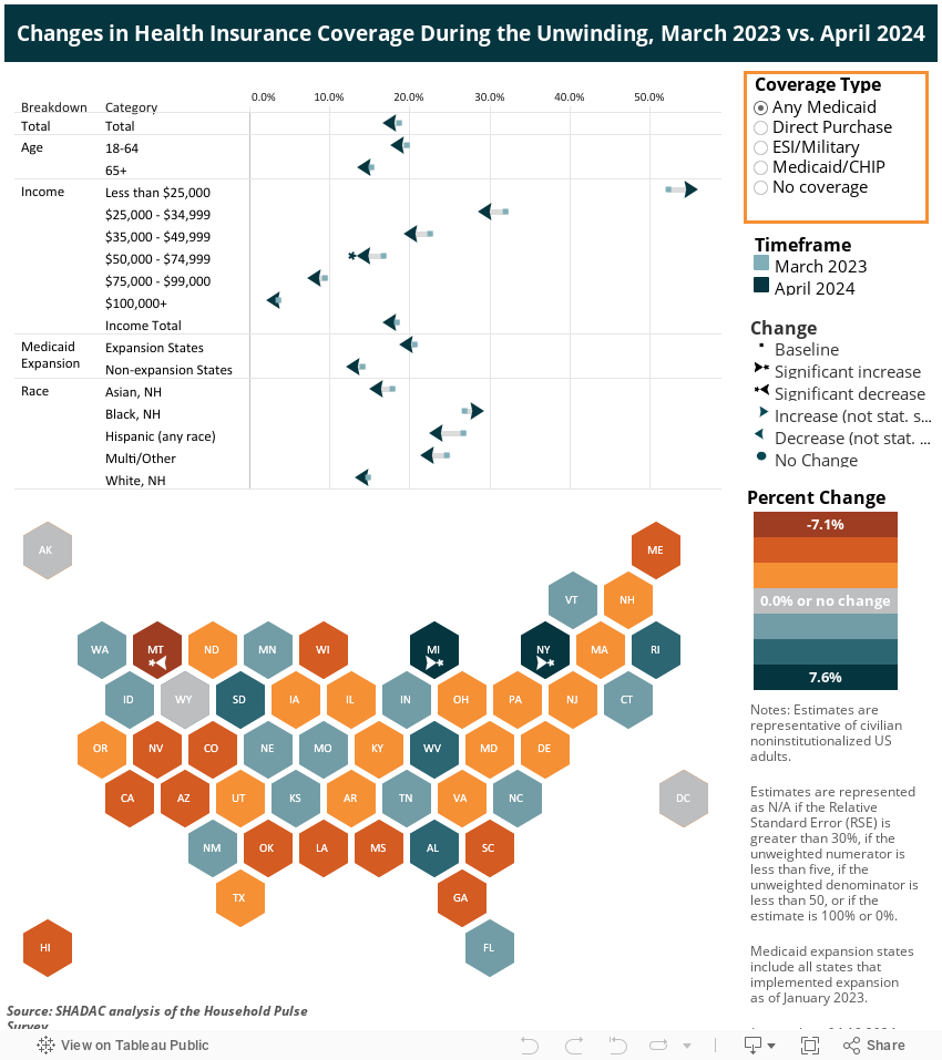
This blog will be updated on a monthly basis as new HPS data are released and compare the latest monthly coverage estimates (reference above in the subtitle) to estimates from March 2023, the last month before the unwinding began.
Highlighted Findings
Limited to statistically significant changes at the 95% confidence level.
-
Rates of Medicaid as a primary source of coverage decreased among Hispanic adults and adults with 2023 household incomes of $25,000 - $34,999, and in the states of Georgia and Montana. Minnesota, Missouri, and Tennessee saw increases in the rate of Medicaid as a primary source of coverage.
-
Other than changes in Medicaid as a primary source of coverage, very few statistically significant changes in insurance coverage were seen in this cycle of the Household Pulse Survey. Other than the following changes, insurance coverage rates remained mostly unchanged:
-
The rate of any Medicaid coverage decreased among adults with 2023 household incomes of $50,000 - $74,999
-
The uninsurance rate increased among Non-Hispanic White adults
-
The rate of ESI coverage increased among adults with 2023 household incomes of $100,000+
-
Select a coverage type from the orange box on the right in the dashboard below to filter the visualizations.
Methods and Data
This analysis uses public use microdata from the Household Pulse Survey (HPS), a monthly, nationally representative, quick-turnaround survey that collects data on topics including household demographics, education, employment, food sufficiency, financial spending, housing security, and physical and mental health, in addition to current health insurance coverage.
The survey has a typical monthly sample size of 60,000 to 80,000 U.S. adults and is designed to produce state-level (and a select number of metropolitan-level) estimates of the civilian noninstitutionalized adult population. The survey does not include children (those age 17 or younger).
As of January 2024, data is collected for approximately four weeks each month from adults age 18 or older via a short, online survey and is released on a monthly basis. Prior to this, data was collected for approximately two weeks each month and released on a monthly basis. Readers should keep in mind that the HPS emphasis on producing near-real-time data comes with the tradeoff of lower levels of data quality compared with “gold standard” surveys such as the American Community Survey (ACS).
These data quality issues include very low response rates (e.g., 6.7% response rate in the March 2023 survey), underrepresentation of harder-to-reach groups (e.g., adults with lower levels of education, young adults), a lack of editing and imputation for most variables, and likely some degree of nonresponse bias. For these reasons, HPS estimates should be treated with a greater degree of caution than estimates from other federal surveys.
Further, like other surveys, the HPS relies on respondents’ self-reporting their coverage, which is often associated with known biases such as the Medicaid Undercount and reflects respondents’ (sometimes imperfect) knowledge of their own coverage rather than the reality reflected in administrative data sources.
The HPS’ health insurance coverage measure is similar to that used in the ACS and asks respondents: “Are you currently covered by any of the following types of health insurance or health coverage plans?” Respondents are allowed to select “Yes” or “No” from among the following coverage types:
1. “Insurance through a current or former employer or union (through yourself or another family member)”;
2. “Insurance purchased directly from an insurance company, including marketplace coverage (through yourself or another family member)”;
3. “Medicare, for people 65 and older, or people with certain disabilities”;
4. “Medicaid, Medical Assistance, or any kind of government-assistance plan for those with low incomes or a disability”;
5. “TRICARE or other military health care”;
6. “VA (including those who have ever used or enrolled for VA health care)”;
7. “Indian Health Service”; or
8. “Other”
The response options for employer coverage [1], TRICARE [5], and VA [6] were combined into one Employer/Military coverage category, and respondents were considered uninsured if they didn’t affirmatively report any coverage under options 1-6.
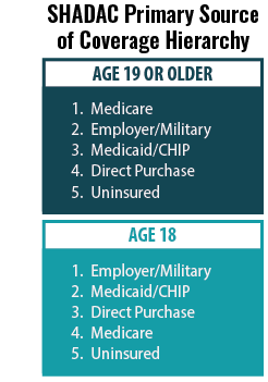 SHADAC’s primary source of coverage hierarchy was applied to determine which payer was likely primary when a respondent reported multiple sources of coverage (see SHADAC brief for more information).
For example, the hierarchy would classify a respondent reporting both Medicaid/CHIP coverage and Employer/Military coverage as having Employer/Military as a primary source of coverage, as Employer coverage typically acts as the primary payer for individuals with Employer and Medicaid coverage.
Estimates with a relative standard error (standard error divided by the percentage estimate) of 30% or greater, based on an unweighted denominator count of less than 50, based on an unweighted numerator count of less than five, or with a weighted estimate of exactly 0% or 100% were considered statistically unreliable and were suppressed.
Two-sided t-tests (95% confidence level) were used to assess statistically significant differences between the most recent data month and the baseline month (i.e., March). A lack of statistically significant difference does not affirmatively establish that there was no significant difference but rather that the data presented here are not sufficient to show a significant difference.
Blog & News

State Dashboards to Monitor the Unwinding of the Medicaid Continuous Coverage Requirement (Cross-Post)
January 11, 2024:
The following content is cross-posted from State Health & Value Strategies.
Authors: Elizabeth Lukanen, Emily Zylla, and Lindsey Theis, SHADAC
This expert perspective (EP) will be updated by SHADAC experts as additional dashboards/reports go live. Please visit the State Health & Values Strategies webpage for the most recent version of this EP.
Original publication date: March 16, 2023. Updated January 11, 2024
As the unwinding of the Medicaid continuous coverage requirement continues, both states and the federal government are tracking and monitoring the impacts of the resumption of eligibility redeterminations and disenrollments. The Centers for Medicare & Medicaid Services (CMS) continues to release monthly batches of required state data reporting metrics. However, given the time-lags and caveats of the CMS data, many states have decided to also publish their own state data dashboards. On December 18, 2023 CMS released an informational bulletin that, for the first time, officially encouraged states to supplement their federal reporting with their own state-specific data analysis, as well as to follow best practices of reporting data broken down by eligibility group and other demographic characteristics (e.g., age, race, ethnicity, language).
Releasing state-data via a dashboard or some other format allows states to follow other specific best practices, including the ability to provide additional detail about definitions, timeframes, and state context that are important for communicating the unique and specific circumstances that states are experiencing during unwinding. Colorado’s state dashboard, for example, highlights the state’s lower unemployment rate and provides context around the state’s reconsideration period in order to help users understand the CMS data reports. Several states are also using state data and insurance dashboards to report how many individuals have been reinstated in Medicaid after a termination (see the SHVS expert perspective on States’ Reporting of Medicaid Unwinding Reinstatement Data), thus telling a more complete story about what happens to individuals after they are disenrolled.
States Publicly Posting Unwinding Data
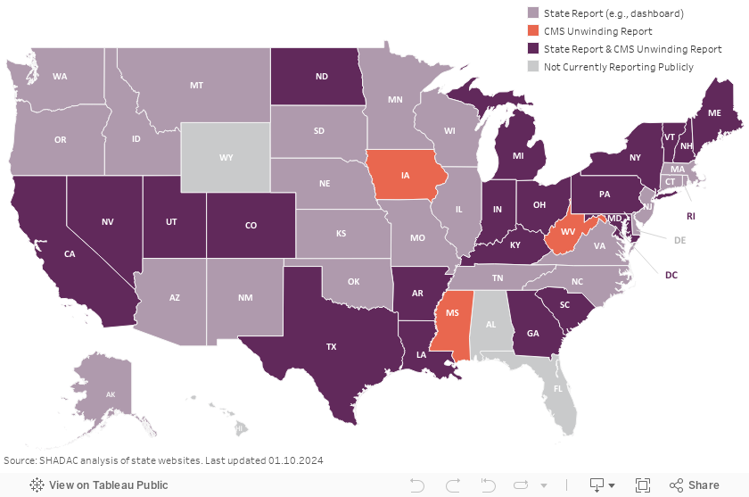
To date, 47 states including the District of Columbia (D.C.) have publicly published their own unwinding data in some format (this does not include states with pre-existing enrollment dashboards that don’t specifically identify unwinding cohorts). In most cases, state Medicaid departments are releasing those data, although some State-Based Marketplaces (SBMs) are also publishing unwinding data (see the SHVS expert perspective on SBM Marketplace Transition Data During the Unwinding). Of the 47 states currently reporting data:
- 24 release state unwinding data online in either an interactive dashboard or static pdf format.
- Three states only release copies of their required CMS Monthly Unwinding Data
- 20 states release both state data and their CMS Monthly Unwinding Data reports.
In some cases, states are publishing unwinding information in an ad-hoc way—such as by a press release. Because these data are not being systematically reported, they are not represented in the map above.
As unwinding has progressed, the number of new states reporting unwinding data has slowed significantly and states are updating their data less frequently. Fifteen states have not updated their state unwinding data reports since October. Arkansas and Idaho report to have completed all redeterminations and are no longer reporting through their unwinding dashboards. Iowa, which was one of the first states to publish a state unwinding dashboard, has removed renewal data from its “Medicaid and Covid Unwind Dashboard.” Both Arkansas and Iowa, however, do continue to make monthly reports to CMS publicly available.
The public release of unwinding data has proven to be a valuable tool in understanding who is losing Medicaid coverage and why. States and advocates have successfully used the data to both monitor outcomes and adjust strategies. While CMS previously indicated it would continue reporting unwinding data through June 2024, CMS’ December informational bulletin noted that states that are not meeting unwinding deadlines or experiencing other compliance issues may be required to provide additional data and/or report information more frequently. Therefore, we encourage all states to continue to make detailed disenrollment, renewal, and call center data (in addition to the enrollment data most states already report) available publicly on an ongoing basis.
SHADAC will continue to update this expert perspective as states update their unwinding data.
Variation in States’ Reporting of Indicators
There is a wide variation in the indicators that states are reporting on their state data dashboards and reports. Of the 47 states reporting publicly, most are now reporting renewal and termination data. Some states are also reporting other interesting indicators such as:
- Reasons for procedural denials (see Colorado example below).
- Number of cases terminated that are re-enrolled or reinstated in Medicaid (see Massachusetts example below).
- Qualitative data from individuals about reasons why they did not renew Medicaid (see New Hampshire example below).
- Enrollment in CHIP (see Utah example below).
It’s important to note that states use different terminology, definitions, population denominators, and timeframes on their dashboards making it difficult to compare one state’s data to another. In some instances, the data displayed on state dashboards also varies from what states include in their monthly reports to CMS (see Georgetown’s State Unwinding Renewal Data Tracker for a summary of states’ monthly CMS reports).
Another cause of variation in the types of indicators reported across states is that states began disenrolling people from Medicaid in different months. For example, Arkansas resumed eligibility determinations in April 2023, and as of October 9th, the state indicated that it had fully completed its statutorily required six-month unwinding process. In contrast, Oregon started initiating procedural terminations in October and plans to take 10 months to complete eligibility redeterminations. Data reporting and interpretation across states is further complicated by the announcement from CMS on August 30, 2023 that 29 states and D.C. had been making ex parte renewal determinations on a household, rather than an individual level as regulations require. This caused some states to pause procedural terminations, reinstate coverage and/or implement temporary extensions for renewal.
Unwinding Indicators & Disaggregated Data Reported by States
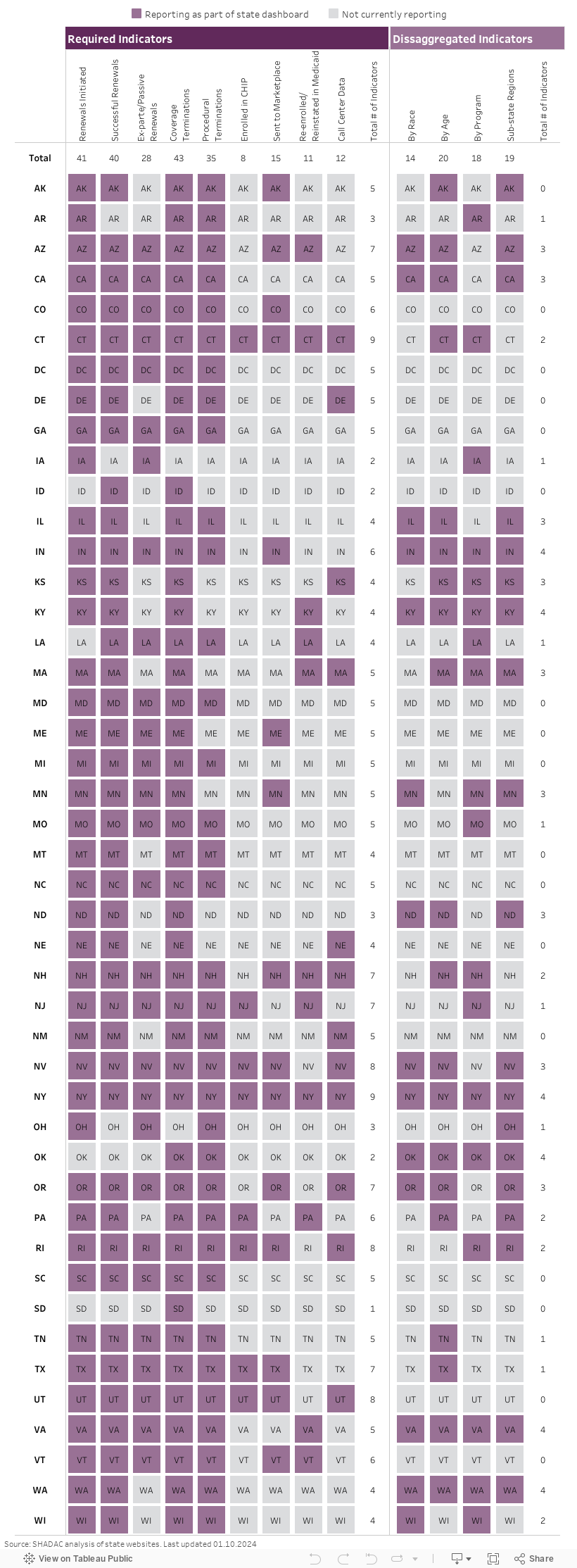
Few states are reporting disaggregated data on their dashboards. The most common breakdowns that states are providing are by age and geography (typically by county). Although CMS only requires states to report data by modified adjusted gross income (MAGI) and non-disability applications versus disability applications, additional data breakdowns by age, race, ethnicity, and program type can elucidate important trends about the disproportionate impact of unwinding on groups that have been economically or socially marginalized. (See the state dashboards below for examples of disaggregated data reporting).
Visit the SHVS Expert perspective to view examples of state unwinding / insurance dashboards in the following states: Arizona, Colorado, Indiana, Massachusetts, Minnesota, New Hampshire, Oregon, Utah, and Washington.
Publication
Disparities in Minnesota's COVID-19 Vaccination Rates
Health inequities are nothing new in the U.S., but the COVID pandemic has placed them in a new light. Numerous studies have reported disparities in how COVID-19 affects many vulnerable groups, often placing them at higher risk of infection, hospitalization, and death. And the inequitable effects of the disease itself are not the only cause for alarm. Once COVID-19 vaccines received authorization, equitable vaccination initiatives became a concern, especially as surveys indicated widespread hesitancy and lagging uptake.
Partnering with the Minnesota Electronic Health Record Consortium, SHADAC delved deep into an analysis of COVID-19 vaccination rates in Minnesota, examining not only point-in-time measures of vaccine disparities but also measuring how quickly the state reached vaccination thresholds for different subpopulations. This webinar will present findings from the study, including analysis of disparities in time-to-vaccination by race and ethnicity, age, and other demographic categories.
Attendees learned about:
- Disparities in COVID-19 vaccination rates across demographic groups
- How policymakers' vaccine prioritization approach may have contributed to health inequities
- Ideas for improved metrics for measuring time-sensitive interventions during public health emergencies
Speakers

Colin Planalp, Speaker
SHADAC
Colin Planalp, MPA, senior research fellow at SHADAC and author on the analysis, will present data published in a recent brief. He will be joined by Tyler Winkelman, MD, MSc, past-President of the consortium and co-director of the Health, Homelessness, and Criminal Justice Lab at Hennepin Healthcare Research Institute. Dr. Winkelman will discuss the Minnesota EHR Consortium and its unique data source, which made the study’s time-to-vaccine analysis possible.
|

Dr. Tyler Winkelman, Speaker
Hennepin Healthcare Research Institute
Dr. Tyler Winkelman is the Past-President of the Minnesota Electronic Health Record Consortium and co-director of the Health, Homelessness, and Criminal Justice Lab at Hennepin Healthcare Research Institute. Dr. Winkelman is also the General Internal Medicine Division Chief at Hennepin Healthcare. He leads the Consortium’s COVID-19 Project, a statewide collaboration with the Minnesota Department of Health to track COVID-19 prevalence, testing, and vaccination among racial and ethnic groups, as well as people experiencing homelessness and/or incarceration.
|
Related Resources
- Webinar slides from SHADAC
- Disparities in Minnesota's COVID-19 Vaccination Rates (Brief)
- Full Transcript
Blog & News

Minnesota’s COVID-19 vaccine campaign left vulnerable groups with lagging rates
August 2, 2023:Health inequities are nothing new in Minnesota, but the pandemic placed them in a new light. Numerous studies have reported disparities in how COVID-19 affects many vulnerable groups, often placing them at higher risk of infection, hospitalization, and death. And the inequitable effects of the disease itself are not the only cause for alarm. Once COVID-19 vaccines received authorization, disparities in vaccination rates also became a concern, especially as surveys indicated widespread hesitancy and lagging uptake.
Partnering with the Minnesota Electronic Health Record Consortium, SHADAC delved deep into an analysis of COVID-19 vaccination rates in Minnesota. Unlike many other studies, we were able to examine not only how COVID-19 vaccination rates differed across different demographic groups, but also how those disparities developed over time. This type of analysis was possible because of the Consortium’s unique dataset, which matches data from large health care providers’ electronic health records—including detailed demographics with immunization records from the Minnesota Department of Health, ultimately covering almost all people who received a COVID-19 vaccine in the state.
Understanding the dynamics of vaccination disparities over time was a crucial element of our study. While we present data on COVID-19 vaccination rates for different demographic subpopulations at the end of 2022, we also examined the time it took to reach 50 percent of people in different demographic groups with COVID-19 vaccinations. That measure of time to vaccination is important because, in a public health crisis during which hundreds or even thousands of people were dying each day at its peak in the U.S. alone, the speed with which people were vaccinated was critical to saving lives.
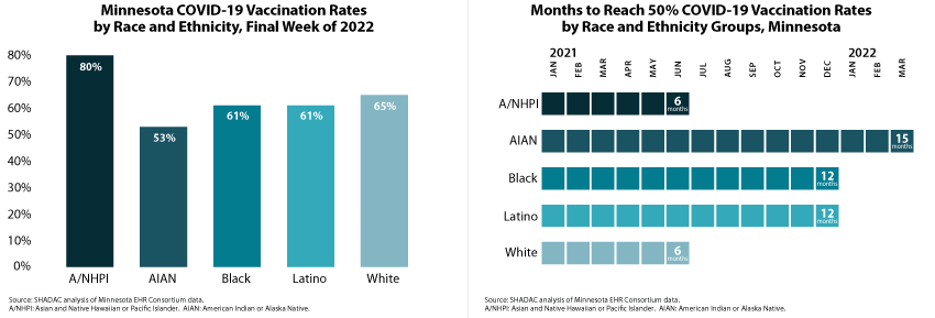
Our approach also allowed us to glean unique insights on COVID-19 vaccination disparities that are hidden below the headline numbers. For instance, although Minnesota’s Black, Latino, and White populations each had similar COVID-19 vaccination rates (61 percent, 61 percent, and 65 percent, respectively) at the end of 2022, they took distinctly different paths to reach that point. Within six months of the first COVID-19 vaccine receiving emergency use authorization, Minnesota vaccinated half of the state’s White population, but it took twice as long (12 months) for the state to vaccinate half of its Black and Latino populations.
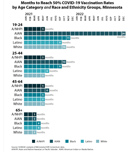 Another crucial but under-recognized factor in COVID-19 vaccination disparities is the way public health policies placed some groups as a disadvantage in accessing vaccines in the early days of limited supply. Because experience showed that elderly people were at higher risk of severe disease and death from COVID-19, they were prioritized to be among the first people eligible for vaccines. But nationwide and in Minnesota, the White population skews older, effectively baking racial and ethnic disparities into the vaccine prioritization criteria. For that reason, we also stratified racial and ethnic groups’ COVID vaccination data by age—an approach that uncovered complex dynamics.
We found that disparities in COVID-19 vaccination rates were relatively small among Minnesota’s elderly population. For instance, Minnesota succeeded in vaccinating half of the elderly population across all racial and ethnic groups within three or four months—an example of how health inequities can be minimized. But disparities were stark among young adults, age 19-24. While Minnesota vaccinated half of Asian and Native Hawaiian and Pacific Islander young adults within five months, it took roughly twice as long to vaccinate half of Latino young adults (nine months), White young adults (ten months), and Black young adults (eleven months). And stunningly, Minnesota had failed to reach half of American Indian and Alaska Native young adults by the end of 2022—approximately 24 months after vaccines were first authorized.
We also examined COVID-19 vaccination rates by other demographic categories, finding higher vaccination rates and quicker vaccination progress among older population groups, urban and suburban communities, and females. Additionally, our study found disappointing rates of COVID-19 vaccination among children, particularly younger children. At the end of 2022, less than one-half of children age 5-11 had been vaccinated, despite having been eligible for vaccines for over a year; and less than one-tenth of children age six months to four years had been vaccinated, despite having been eligible for roughly six months. Despite a common, incorrect notion that COVID-19 is harmless for children, other researchers have found that COVID-19 was a top 10 cause of death for children during the pandemic, so those low vaccination rates are needlessly leaving Minnesota kids at risk.
Together, the findings from this new study highlight two main points: First, Minnesota’s COVID-19 vaccination efforts resulted in clear disparities. When looking at high-level data, it is easy to miss those disparities because some of them narrowed over time. But looking at detailed data illustrates the ways that certain groups were left vulnerable to COVID-19 for much longer than others. Second, our findings on disparities in the time Minnesota took to vaccinate half of different subpopulations demonstrate the importance of monitoring such health equity measures over time. Time is critical in an emergency such as the pandemic, and eventually closing gaps in health disparities simply isn’t good enough. Health equity requires urgency.
Publication
Disparities in Minnesota’s COVID-19 Vaccination Rates
A new SHADAC issue brief found stark disparities not only in the share of subpopulations that have been immunized against COVID-19 in Minnesota, but also in the length of time it took vaccines to reach most people in these different groups.
For instance, by the end of 2022, 80 percent of Asian and Native Hawaiian and Pacific Islander people in Minnesota were vaccinated against COVID-19, but only 53 percent of American Indian and Alaska Native people in the state were vaccinated.
|
Similarly, while Minnesota successfully vaccinated half of the state’s Asian and Native Hawaiian and Pacific Islander population and White population within six months of the first COVID-19 vaccine authorization, the state took fifteen months to reach vaccination for half of the American Indian and Alaska Native population. |
The study also found wider and more obvious disparities among younger segments of Minnesota’s population. For instance, half of the elderly population (age 65+) in all racial and ethnic groups were vaccinated within similar time frames of just three or four months. However, among young adults age 19-24, Minnesota was able to vaccinate half of Asian and Native Hawaiian and Pacific Islander young adults within five months but took roughly twice as long to reach half of Latino young adults (nine months), White young adults (ten months), and Black young adults (eleven months). And, shockingly, Minnesota had failed to reach half of American Indian and Alaska Native young adults by the end of 2022—almost two years after vaccines were first authorized.
The analysis also looked at vaccination data by categories of geography and sex, and for children separately, as vaccines for their age group were developed and authorized later than for adults. All data used in SHADAC’s analysis were provided through a collaboration with the Minnesota Electronic Health Record Consortium, a partnership of state health systems and public health agencies aimed at providing comprehensive and timely data to better inform policy.
Click on the image above to read the full brief.