Blog & News
Lanigan, Lindsey
Planalp, Colin


Measuring State-level Disparities in Unhealthy Days (infographics)
January 2, 2022:Although health disparities in the United States have been common knowledge among public health professionals for years, the COVID-19 pandemic highlighted this problem with vivid urgency. The disproportionate impact of the pandemic on certain segments of the population—such as higher infection and death rates among Black people and American Indian and Alaska Native people—isn’t an aberration but rather a consequence of systems that fail many communities. Health inequities run wide and deep in the U.S., extending far beyond COVID into other areas of physical and mental health.
Another issue the pandemic has highlighted is the enormous power that states have to influence health policy, as shown recently by mask and vaccination requirements instituted by some states—and prohibited by others. As the pandemic wanes, states will have a new opening to exercise their powers to tackle health inequities.
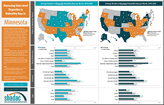
To help policymakers and other stakeholders identify opportunities to improve health equity in their states, SHADAC has produced a set of data resources for the 50 states and the District of Columbia. Using the Behavioral Risk Factor Surveillance System (BRFSS) Survey—combining the three most recent years of data (2018-2020) to improve our ability to develop reliable state-level estimates for smaller population subgroups—we created both maps and charts that show how states compare to the U.S. average in measures of people’s self-reported physical and mental health, and how people’s physical and mental health varies depending on their race and ethnicity, level of income, and age within each state.
Click any state below to view its factsheet or click here to download a PDF of this blog and all state factsheets.
State physical and mental health
To assess how state residents’ physical and mental health matches up against the U.S. overall, SHADAC used statistical testing to compare the average number of days in the prior month that adults in each state report their physical or mental health was “not good” versus the average number for the same metric across the entire U.S.
Physical health
Among the states, 19 had an average number of physically unhealthy days that was better (i.e., lower) than the U.S. average of 3.8 days per month. Meanwhile, 20 states had an average number of physically unhealthy days that was worse (i.e., higher) than the U.S. average. The remaining 12 states had average numbers of physically unhealthy days that were not significantly different from the U.S. rate.
The District of Columbia reported the lowest average number of physically unhealthy days per month, at 3.0 days, while West Virginia reported the highest average number, at 5.5 days—a difference of two and a half extra days.
Mental health
For mental health, 17 states had an average number of unhealthy days that was better (i.e., lower) than the U.S. average of 4.2 days per month. Meanwhile, 19 states had an average number of mentally unhealthy days that was worse (i.e., higher) than the U.S. average. The remaining 15 states had average numbers of mentally unhealthy days that were not significantly different from the U.S. rate.
South Dakota reported the lowest average number of mentally unhealthy days per month, at 3.3 days, while West Virginia again reported the highest average number, at 5.7 days—a difference of almost two and a half extra days.
In addition to considering them separately, we also found substantial overlap in the states with mentally and physically unhealthy days that were significantly different from the U.S. average: 15 states had average numbers of unhealthy days that were better than the U.S. average for both physical and mental health, and 16 states had average numbers of unhealthy days that were worse than the U.S. average for both.
However, there were examples in which states demonstrated distinct differences. For instance, Utah and the District of Columbia both had physically healthy days that were significantly lower than the U.S. average, while their mentally unhealthy days were significantly higher than the U.S. average.
Physical and mental health inequities
While the dynamics vary state-to-state, physical and mental health data at the national level demonstrate clear inequities by demographics, including race and ethnicity, income, and age.
Race and ethnicity
Physical health
For the total U.S. population, the self-reported average of physically unhealthy days was 3.8 per month. This number varied across racial and ethnic population subgroups, with some clear health disparities—a finding that is consistent with other evidence of pervasive health inequities influenced by conditions such as discrimination and social risk factors, including lower incomes and limited access to health care.1
Asian and Pacific Islander people reported the lowest number of physically unhealthy days, at 2.0 days per month, which was significantly lower than the total population. Hispanic people also reported physically unhealthy days that were significantly lower than the total population, at 3.6 days per month.
American Indian and Alaska Native people reported the highest number of physically unhealthy days, at 5.9 days per month, which was significantly higher than the total population rate. Black people and White people reported average physically unhealthy days that were only slightly higher than the total population, at 3.9 days and 3.8 days per month, though those small differences were still significantly different.2 People reporting Any other race or multiple races also reported physically unhealthy days that were significantly higher than the total population, at 4.7 days per month.
Mental health
The pattern for mentally unhealthy days by race and ethnicity was similar to that for physically unhealthy days. For the total U.S. population, people reported an average of 4.2 mentally unhealthy days per month. Asian and Pacific Islander people reported the lowest number of mentally unhealthy days, at 2.8 days per month, which was significantly lower than the total population. Hispanic people also reported mentally unhealthy days that were significantly lower than the total population, at 4.0 days per month.
People reporting Any other race or multiple races reported the highest average number of mentally unhealthy days, at 5.9 days per month, which was significantly higher than the total population. American Indian and Alaska Native people reported the second-highest number of mentally unhealthy days, at 5.7 days per month, which again was significantly higher than the total population rate. Black people and White people reported average mentally unhealthy days that were only slightly higher than the total population, at 4.4 days and 4.3 days per month—seemingly small differences that were nevertheless statistically significant.
Income
Physical health
For the U.S. population, self-reported physical health was worse among people with lower incomes and better among people with higher incomes—an unsurprising finding, as income is associated with many factors related to health. For instance, people with lower incomes are more likely to live with poor air quality, as highways and industrial facilities that produce pollution tend to be found nearer to low-income housing.3,4 And people with higher incomes are more likely to have both health insurance and easier access to health care.5
People with incomes of $75,000 or more (the highest category in our analysis), reported the lowest average number of physically unhealthy days, at 2.1 per month. Furthermore, the average number of physically unhealthy days reported by individuals increased as their incomes decreased, with those in the $50,000 to $74,999 income category reporting 3.0 days per month. Both of those were significantly lower than the total U.S. population rate of 3.8 physically unhealthy days per month.
People with the lowest incomes (below $25,000), reported the highest average number of physically unhealthy days at 6.4 days per month—a figure roughly two and a half days higher than the total U.S. population and a statistically significant difference. Those with incomes between $25,000 and $49,999 reported 3.9 physically unhealthy days per month, which was just slightly higher than the total U.S. population number of 3.8 days, though the difference was still statistically significant.
Mental health
The overall pattern for self-reported mentally unhealthy days by income was almost identical to that for physically unhealthy days. People with the highest ($75,000 and higher) and next-highest ($50,000 to $74,999) incomes reported the lowest average mentally unhealthy days, at 3.0 and 3.8 days per month, respectively. Both were significantly lower than the average number of mentally unhealthy days for the U.S. population, at 4.2 per month.
People with the lowest incomes (less than $25,000) reported the highest number of mentally unhealthy days, at 6.3 days per month. That was roughly two additionally mentally unhealthy days compared to the total population average, a statistically significant difference. People with the next-lowest incomes ($25,000 to $49,999), reported an average of 4.5 mentally unhealthy days per month, which also was significantly higher than the total population average.
Age
Physical health
For the U.S. population, the number of self-reported physically unhealthy days increased along with age, a finding that is consistent with the fact that many common chronic health issues—such as heart disease and diabetes—are more prevalent among the older population.
Adults age 65 and over (“older adults”) reported the highest average number of physically unhealthy days, at 5.1 days per month, which was more than one day over the total U.S. population average of 3.8 days—a statistically significant difference. Adults age 40-64 (“middle-aged adults”) also reported an average number of physically unhealthy days that were significantly higher than the total U.S. population average, at 4.3 days per month. Meanwhile, adults age 18-39 (“younger adults”) reported the lowest average number of physically unhealthy days, at 2.4 days per month, which was almost two and a half fewer days than the total U.S. average—a statistically significant difference.
Mental health
In contrast with physically unhealthy days, the pattern for mentally unhealthy days by age was reversed: Average mentally unhealthy days declined as age increased. Though this pattern may be surprising to those unfamiliar with issues of mental health, it is consistent with other evidence, such as data from the National Survey on Drug Use and Health (NSDUH), which finds that mental illness is roughly twice as common among adults 25 years and younger as compared to adults age 50 and older.6
Younger adults reported the highest average number of mentally unhealthy days per month, at 5.3 days. That number was roughly one day more than the total U.S. population rate of 4.2 days, a statistically significant difference. Meanwhile, older adults reported an average of 2.6 mentally unhealthy days per month, roughly one and a half fewer days than the overall U.S. population, and middle-aged adults reported an average of 4.1 mentally unhealthy days per month, which was only slightly lower than the overall population, but still a statistically significant difference.
Conclusion
Understanding how individuals’ self-reported mental and physical health vary across the states and by subpopulation at the national level offers one approach to identifying broad health inequities. Comparing the average number of physically and mentally unhealthy days for state residents against the U.S. average can allow states to identify widespread gaps. And within their populations, those same data offer states an opportunity to identify more specific health inequities. At the U.S. level, data show that certain demographic groups experience worse health. For instance, American Indian and Alaska Native people on average report significantly worse mental and physical health, as do people with lower incomes. Meanwhile, younger adults report significantly worse mental health, while older adults report significantly worse physical health. The state-level data SHADAC has published in this resource provides states with an ability to examine health inequities for their particular populations.
Click here to download this blog, data tables, and all state factsheets.
1 Centers for Disease Control and Prevention (CDC). (December 2020). Introduction to COVID-19 Racial and Ethnic Health Disparities. https://www.cdc.gov/coronavirus/2019-ncov/community/health-equity/racial-ethnic-disparities/index.html
2 With rounding, the difference between the average number of physically unhealthy days for White people versus the total population isn’t apparent; however, it is just under 0.1 days (3.75 for the U.S. total, 3.84 for White people).
3 Finkelstein, M.M., Jerrett, M., DeLuca, P., Finkelstein, N., Verma, D.K., Chapman, K., & Sears, M.R., (2003, September 2). Relation between income, air pollution and mortality: A cohort study. CMAJ JAMC, 169(5), 397-402. https://www.ncbi.nlm.nih.gov/pmc/articles/PMC183288/
4 Pratt, G.C., Vadali, M.L., Kvale, D.L., & Ellickson, K.M. (May 2015). Traffic, air pollution, minority and socio-economic status: Addressing inequities in exposure and risk. Int J Environ Res Public Health, 12(5), 5355-5372. https://www.ncbi.nlm.nih.gov/pmc/articles/PMC4454972/
5 State Health Compare. (n.d.). State Health Compare. State Health Access Data Assistance Center (SHADAC). http://statehealthcompare.shadac.org/
6 National Institute of Mental Health (NIMH). (n.d.). Mental illness. National Institute of Health (NIH). https://www.nimh.nih.gov/health/statistics/mental-illness
Blog & News

State Health Compare: State-Level Data Resources on Measures of Health Equity (Part One - Coverage, Affordability and Cost of Care, Access to Care, and Quality of Care)
December 22, 2021:Health equity and social determinants of health (SDOH) are rapidly growing fields of public health research. SHADAC researchers believe that making strides toward achieving health equity depends equally on better understanding health disparities as well as on making concerted, measurable efforts toward reducing avoidable differences in populations’ health outcomes.
This blog, the first in a two-part series, provides a high-level overview of a range of state-level measures currently housed on SHADAC’s online data tool, State Health Compare, which may help states understand and track trends across indicators of health equity, such as health insurance coverage, health care access and affordability, and quality of care.
Insurance Coverage
One of the essential steps towards achieving health equity is providing comprehensive and affordable health insurance coverage in order to provide reasonable and increased access to health care services. State Health Compare provides annually updated state-level measures of health insurance coverage across a number of populations, including populations that have been historically marginalized.
Coverage Type (2020 only)*
This measure shows the rates of different types of health insurance coverage (Medicare, employer-sponsored insurance [ESI], Medicaid, individual, as well uninsurance) for 2020 only. Users can view this single-year measure by a limited set of breakdowns such as age, health status, and poverty level. Related Resource: In light of the data quality challenges noted for the 2020 American Community Survey (ACS), SHADAC instead analyzed estimates of national-level health insurance coverage for 2020 using the Current Population Survey (CPS). A recent blog looks at U.S. trends in rates of the uninsured, public and private coverage changes, and breakdowns by age, income level, race/ethnicity, and state Medicaid expansion status.
Coverage Type (2008-2019)
This measure shows the rates of different types of health insurance coverage, including Medicare, employer-sponsored insurance (ESI), Medicaid, and individual coverage, as well as no insurance coverage. Users can view this measure by a variety of breakdowns, including: age, citizenship, disability status, education, family income, health status, limited English proficiency, marital status, poverty level, race/ethnicity, sex, and work status. Related Resource: As part of our fall data release coverage, SHADAC produces an annual three-part blog series looking at health insurance coverage data from the American Community Survey (ACS). The first blog looks at state-level information about health insurance coverage by type, including uninsurance and private and public coverage for 2019.
Health Care Affordability
While having health insurance coverage is a critical step in eliminating health disparities, achieving equity also requires that everyone has sufficient resources to afford and access needed care or are adequately protected from health care costs by adequate and comprehensive health insurance coverage.
People with High Medical Care Cost Burden (2010-2012, 2013-2017, 2017-2020)*
This measure highlights the percent of individuals in families where out-of-pocket health care spending, including premiums, has exceeded 10 percent of annual income. Breakdowns by employer coverage, income, and race/ethnicity are available for each state.
Adults Who Forgo Needed Medical Care (2005-2010, 2011-2020)*
Data for this measure indicates the percent of adults in each state who could not get needed medical care due to cost. Breakdowns by education level and race/ethnicity are available for all states. Related Resource: SHADAC recently updated a blog focusing on racial/education inequities in access and ability to afford medical care, using the latest estimates (2019) for this measure along with estimates for Adults with No Personal Doctor. The original blog, Affordability and Access to Care in 2018: Examining Racial and Educational Inequities across the United States (Infographic), looked at the effects of rising health costs on delaying or skipping needed care.
Access to Health Care
Much like the ability to afford health care, individuals’ ability to access care has a number of associations with overall physical, social, and mental health status of populations. Individuals with no or weak connections to the health care system are less likely to get timely and adequate health care when needed.
Adults with No Personal Doctor (2005-2010, 2011-2020)*
This measure shows the percent of adults without a personal doctor and offers breakdowns by education level and race/ethnicity. Related Resource: SHADAC recently updated a blog focusing on racial/education inequities in access and ability to afford medical care, using the latest estimates (2019) for this measure along with estimates for Adults Who Forgo Needed Medical Care. The original blog, Affordability and Access to Care in 2018: Examining Racial and Educational Inequities across the United States (Infographic), looked at the effects of rising health costs on delaying or skipping needed care.
Broadband Internet Access (2016-2019)
Estimates for this measure show the percent of households that have a broadband internet subscription, which is an increasingly essential means of finding and accessing care and communicating with health care providers. Related Resource: SHADAC recently produced two new blogs aimed at measuring the impact of disparities in access to broadband internet across the states in light of coronavirus. The first blog looks at disparities in state-level broadband access by income, rurality, coverage, and disability status; the second examines the role broadband access plays in eliminating access barriers to healthcare services, such as enabling telehealth visits during the COVID pandemic.
Physicians Who Accept New Medicaid Patients (2014-2017)
State Health Compare’s newest measure, Physicians Who Accept New Medicaid Patients, provides a measure of the percent of physicians who reported accepting payments from Medicaid patients among the total number of physicians who accept new patients. Multiple years of data for this measure have been pooled together in order to provide reliable state-level estimates, and the measure can be broken down by the ratio of mid-level providers, setting, and share of Medicaid patients. Related Resource: In addition to producing the only state-level estimates available for this measure, SHADAC also published a factsheet for the Medicaid and CHIP Payment Access Commission (MACPAC) that analyzed physician acceptance of new Medicaid patients at the national and state levels, and found significant variations in rates of acceptance by state and by various patient, physician, and practice characteristics.
Quality of Care
Achieving health equity not only includes making strides toward increasing health insurance coverage and access to affordable health care but also ensuring that all populations receive high-quality care.
Adult Cancer Screenings (2005-2010, 2012-2020)
This measure shows the percentage of adults who have received the recommended cancer screenings, such as pap smears, colorectal cancer screenings, and mammograms, in the past year. Breakdowns for these estimates are available by education level and race/ethnicity categories.
Adult Flu Vaccinations (2017-2019)
One of the most recent additions to State Health Compare, this measure provides an estimate of the rate of adults (18+) who received a flu vaccine in the past twelve months, with breakdowns available by age, chronic disease status, coverage type, education, household income category, metropolitan status, personal doctor status, race/ethnicity, and sex. In order to provide reliable state-level estimates for smaller subpopulations, multiple years of data for this measure have been pooled together. Related Resource: Using this measure, SHADAC researchers produced a set of 50-state infographics showing State-level Flu Vaccination Rates among Key Population Subgroups as the best available proxy for predicting and understanding possible vaccination patterns for COVID-19. Each individual state infographic highlights vaccination rates for individual states compared with a number of demographic categories, including age, race/ethnicity, household income level, insurance status, chronic conditions, access to care, and educational attainment.
Notes
For a full overview of all available state-level measures, please visit the “Explore Data” page on State Health Compare, or take a look at our one-page guide to State Health Compare measures and their data sources.
All measures marked with an “*”: This indicates a break in series due to survey changes in either data processing or implementation methodology.
Blog & News

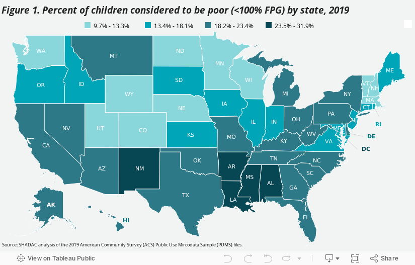
Monitoring Childhood Poverty during and after COVID-19
November 16, 2021:Childhood poverty has been brought to the forefront during the COVID-19 pandemic, with pandemic restrictions making it harder for families with low incomes to meet the needs of their children.1 As schools switched to distance learning, many children from low-income households faced new or heightened food insecurity without access to free and reduced-price lunches at school sites. Remote schooling worsened inequities as children from low-income households also disproportionately lacked sufficient access to technology and home learning environments that were safe and well-supervised.2,3,4 Moreover, recent studies point toward the number of children dealing with the challenges of poverty increasing as the pandemic progressed, with the number of children living in poverty growing by an estimated 2.5 million between May 2020 and September 2020.5
|
Defining Poverty |
What the 2019 Data Tell Us
The most recent annual estimates of childhood poverty at the federal and state
levels come from the Census Bureau’s 2019 American Community Survey (ACS).
Consideration of 2019 childhood poverty rates across the country provides important pre-pandemic baseline context for future understanding of how the COVID-19 crisis
may have impacted children and families who are living in poverty. The 2019 ACS data show that:
| - Nearly one in every five children in the United States lived in poverty in 2019. | ||||
| - Mississippi had the highest child poverty rate with almost one in every three children (31.9 percent) living in poverty. | ||||
| - New Hampshire had the lowest child poverty rate with less than one in every ten children (9.7 percent) living in poverty. | ||||
| - Child poverty rates tended to be higher in states across the South. (Figure 1.) The five states with the highest rates were: | ||||
| Mississippi | Louisiana | Arkansas | New Mexico | District of Columbia |
| 31.9% | 29.6% | 25.4% | 25.6% | 25.1% |
| - States with lower childhood poverty rates were spread across the Northeast, Midwest, and West Census Regions. (Figure 1.) The five lowest rates were found in: |
||||
| New Hampshire | North Dakota | Minnesota | Wyoming | Nebraska |
| 9.7% | 9.8% | 10.9% | 12.0% | 12.1% |
What Happened in 2020?
Unfortunately, the data that SHADAC uses to measure Children in Poverty comes from the American Community Survey (ACS), for which the U.S. Census Bureau announced in July 2021 that it will not be releasing its standard 1-year estimates from 2020 due to impacts of the COVID pandemic. Instead, the Bureau plans to release 2020 ACS 1-year “experimental” estimates in November 2021, for which they have cautioned against use in analysis due to substantially lower response rates than usual and nonresponse bias.
However, the Census Bureau has released 2020 estimates from another major survey, the Current Population Survey (CPS), which SHADAC has also used to produce special, 1-year only, state-level estimates of health insurance coverage in lieu of data from the ACS.
Nationally, the CPS shows that the rate of childhood poverty was 16.1 percent in 2020, representing approximately 11.6 million children. While this rate represents a statistically significant increase from 14.4 percent in 2019, the Census Bureau has again cautioned that data from this year may also have been impacted by the pandemic. Comparing with the rate of 16.2 percent of children at 2018, then, shows a potentially more stable trend, as this rate does not statistically differ from 2020.6 The extent to which children in poverty have been affected by the COVID-19 pandemic therefore remains uncertain at this time, and researchers at SHADAC plan to continue monitoring a variety of data sources in order to determine which, if any, might be able to paint a clear picture of what happened to measures of poverty in the U.S. in 2020.
Conclusion
The country is opening back up as COVID-19 vaccination rates grow. However, families with lower incomes, in particular, are still recovering from over a year of shut-down activities and the challenges of poverty that have been potentially exacerbated by the COVID-19 public health crisis.7 Federal and state policymakers have targeted relief at these same families, recognizing the particular hardships they have faced during the pandemic. At the federal level, the American Rescue Plan Act of 2021 began distributing the Child Tax Credit - that includes extended SNAP benefits as well as direct payments - to qualifying families beginning in July 2021, which may also play a role in attempts to reduce childhood poverty in 2021.8 And some states have passed measures of their own to support families with lower incomes who have children. In Minnesota, for example, the state’s current budget includes provision for a one-time payment of up to $435 to support about 32,000 families, including 64,000 children. In Washington, legislators passed a tax exemption for working families with lower incomes that will provide up to $1,200 per year to residents of the state.9
Estimates of childhood poverty rates in 2020, if they are able to be made available at some point, may indicate the extent to which state-level efforts, in particular, have been applied in areas of the country where they were most needed and will also indicate where further efforts to remediate childhood poverty are still required. Further monitoring will be necessary in subsequent years to identify ongoing and new areas of need as well as areas where policies to remediate childhood poverty may have been beneficial.
About the Data
The estimates cited here can be accessed through SHADAC’s online data tool, State Health Compare. Estimates are available for 2008-2019 and are generated by SHADAC’s analysis of the American Community Survey (ACS) Public Use Microdata Sample (PUMS).
1 Children’s Defense Fund. (2021). The State of America’s Children® 2021: Child poverty. https://www.childrensdefense.org/state-of-americas-children/soac-2021-child-poverty/
2 Lakahni, R. (2020, November 4). Learning from a distance: How remote learning can set low-income students back further. RTI International: Insights. https://www.rti.org/insights/how-remote-learning-impacts-low-income-students-covid-19
3 Povich, E. (2020, July 29). Virtual learning means unequal learning. Pew: Stateline. Available at https://www.pewtrusts.org/en/research-and-analysis/blogs/stateline/2020/07/29/virtual-learning-means-unequal-learning
4 Collis, V., & Vegas, E. (2020, June 22). Unequally disconnected: Access to online Learning in the US. Brookings: Education Plus Development. https://www.brookings.edu/blog/education-plus-development/2020/06/22/unequally-disconnected-access-to-online-learning-in-the-us/
5 Rodriguez, L. (2020, October 16). 8 Million more people in the US are now living in poverty due to COVID-19. Global Citizen. https://www.globalcitizen.org/en/content/millions-more-people-in-poverty-during-covid-19/
6 Shrider, E.A., Kollar, M., Chen, F., & Semega, J. (2021, September 14). Income and Poverty in the United States: 2020 [P60-273]. U.S. Census Bureau. https://www.census.gov/library/publications/2021/demo/p60-273.html
Semega, J., Kollar, M., Shrider, E.A., & Creamer, J. (2020, September 15). Income and Poverty in the United States: 2020 [P60-270]. U.S. Census Bureau. https://www.census.gov/library/publications/2020/demo/p60-270.html
7 Center on Budget and Policy Priorities. (2021, October 13). Tracking the COVID-19 economy’s effects on food, housing, and employment hardships. COVID Hardship Watch. Washington, DC: Center on Budget and Policy Priorities. https://www.cbpp.org/research/poverty-and-inequality/tracking-the-covid-19-recessions-effects-on-food-housing-and
8 H.R. 1319 American Rescue Plan Act of 2021. 117th Congress (2021-2022). https://www.congress.gov/bill/117th-congress/house-bill/1319/text
9 Goldbert, M. (2021, April 23). Analysis: Working families’ tax exemption will provide up to $1,200 per year to low-income Washingtonians. Washington State Wire. https://washingtonstatewire.com/analysis-working-families-tax-exemption-will-provide-up-to-1200-per-year-to-low-income-washingtonians/
Blog & News

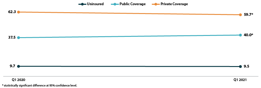
2021 NHIS Early Release: Stable uninsured rate paired with increase in public coverage and decrease in private coverage
October 14, 2021:The National Center for Health Statistics (NCHS) has released quarterly estimates of health insurance coverage from January 2020-March 2021 from the National Health Interview Survey (NHIS) as part of the NHIS Early Release Program. These are some of the first estimates of health insurance coverage during 2021 from a major, federal government survey. This post compares uninsurance, private coverage, and public coverage rates in the first quarter of 2021 (Q1 2021) to those rates in the first quarter of 2020 (Q1 2020) and focuses on coverage by age group and federal poverty level (FPL).
Uninsured rates were stable among all age groups; Public and private coverage saw significant changes among all age groups
The uninsured rate remained stable in the first quarter of 2021, at an overall 9.5 percent for all ages, 11.3 percent for the non-elderly (age 0-64), 4.6 percent for children (age 0-17), and 13.8 percent for non-elderly adults (age 18-64).
All age groups except non-elderly adults saw increases in rates of public coverage. Public coverage increased 2.5 percentage points (PP) among all ages and for the non-elderly, increasing to 40.0 percent and 28.3 percent, respectively. Children saw an increase of 4.7 PP, rising to 45.6 percent with public coverage in Q1 2021.
Rates of private coverage fell 2.6 PP to 59.7 percent in Q1 2021 for those of all ages. Rates of private coverage were statistically unchanged for other specified age groups.
Figure 1. Health insurance coverage by type (all ages), Q1 2020 vs. Q1 2021
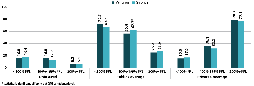
Coverage largely unchanged by poverty level
Rates of uninsurance were stable by poverty level in the first quarter of 2021. For those with incomes below 100% FPL, 18.4 percent were uninsured in Q1 2021. In other categories, 13.7 percent of those with incomes at 100%-199% FPL were uninsured, and 6.1 percent of those with incomes at or above 200% FPL were uninsured.
Rates of public coverage were statistically unchanged for those with incomes below 100% FPL (67.5 percent) and for those with incomes at or above 200% FPL (26.9 percent). Those with incomes 100%-199% FPL saw a 5.9 PP increase in rates of public coverage, rising to 62.3 percent in Q1 2021.
Rates of private coverage were stable by poverty level. Those with incomes below 100% FPL had a private coverage rate of 17.0 percent, those with incomes 100%-199% FPL had a private coverage rate of 32.2 percent, and those with incomes at or above 200% FPL had a private coverage rate of 77.1 percent.
Figure 2. Health insurance coverage by type by poverty level (all ages), Q1 2020 vs. Q1 2021
A note on changes to the NHIS data collection methodology
In response to the COVID-19 pandemic, the NHIS changed to a telephone-only and then telephone-first with in-person follow up data collection methodologies beginning on March 19, 2020. Though this did not affect the Q1 2020 estimates, NCHS’s analysis indicates that the change to telephone-only data collection led to an “over-representation of affluent households,” which may have affected the Q1 2021 estimates. More information on changes to federal survey methodology due to the COVID-19 pandemic is available in the SHADAC brief, Changes in Federal Surveys Due to and During COVID-19.
Blog & News
Now Available on State Health Compare: Special 2020-Only Health Insurance Coverage Measure and 2020 Updates to Several BRFSS Measures
October 6, 2021:
As has been previously noted, estimates for our Health Insurance Coverage Type measure will this year come from the U.S. Census Bureau’s Current Population Survey (CPS) Annual Social and Economic Supplement (ASEC), rather than the American Community Survey (ACS), due to a number of impacts on survey data and data collections efforts attributed to the COVID-19 pandemic.
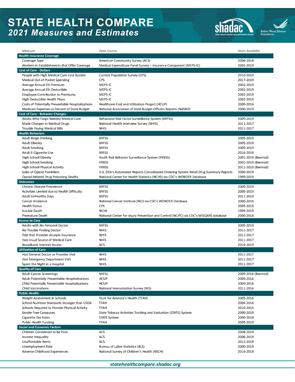
In light of this, SHADAC has created a separate Health Insurance Coverage measure for 2020 data only on our State Health Compare site. Estimates for 2020 have been created specifically for that year, and should not be compared to other years of data, which come from the ACS. For more on the differences between the ACS and the CPS, see our recent blog that discusses key divergences and considerations for users of this data.
Health Insurance Coverage Type (2020)
Data for this measure show the percentage of the United States population that had a specific type of health insurance coverage (e.g., public, private, Medicaid, Medicare, etc.) at any point during the 2020 year. Estimates for uninsurance, however, represent the percent who were uninsured all year. Breakdowns for each type of coverage, as well as age and health status, are available for this measure.
State Health Compare also contains several other measures that come from the CPS ASEC, relating to cost of care.
Measures that have been updated from the CPS ASEC include:
People with High Medical Care Cost Burden^
This measure counts the portion of individuals who are part of families whose out-of-pocket spending on health care accounted for more than 10 percent of their annual income. Breakdowns for this measure are available for race/ethnicity, income levels, and also employer insurance coverage. Estimates are available for three clusters of years: 2010-2012, 2013-2017, and 2017-2020.
Medical Out-of-Pocket Spending
This measure provides an estimate of the average out-of-pocket costs of health care, or costs that are not covered by health insurance but paid for out of an individual’s own resources. These costs include premiums and medical expenses not covered by their medical plan, such as copays for doctor and dentist visits, diagnostic tests, prescription medicine, glasses and contacts, and medical supplies, among others. Data are available for years 2017-2020 and can be broken down by employer health insurance coverage.
Estimates for a majority of measures from several categories (Access to Care, Cost of Care, Health Behaviors, and Health Outcomes) have now been updated from the Behavior Risk Factor Surveillance System (BRFSS), which surveys adults 18+ regarding health-related risk behaviors, chronic health conditions, and use of preventive services, and is conducted by the Centers for Disease Control and Prevention.
Measures that have been updated from the BRFSS include:
Adults Who Forgo Needed Medical Care*
The measure indicates the percent of adults (18+) in each state who could not get needed medical care due to cost. Breakdowns by education level, race/ethnicity, and also now for chronic health status, are available for all states from 2005 through 2010 and 2011 through 2020.
Adults With No Personal Doctor*
This measure presents the percent of adults without a personal doctor and is now available for all states from 2005 through 2010 and 2011 through 2020. Breakdowns by education level and race/ethnicity are also available.
Chronic Disease Prevalence*
Data for this measure captures the percent of adults who reported having one or more common chronic conditions such as diabetes, cardiovascular disease, heart attack, stroke, and asthma, in each state. Estimates are now available for all states from 2005 through 2010 and 2011 through 2019.
Adult Cancer Screening*
Estimates for this measure, which are now available for all states from 2005 through 2010 and 2011 through 2020, show the percentage of adults who have received the recommended cancer screenings.
Adult Unhealthy Days
There are a multitude of options for this measure, which shows the average number of days when an adult's physical health or mental health was not good during the past 30 days. Users can view estimates solely by reported mentally unhealthy days, physically unhealthy days, or a combination of both (which is capped at a total of 30 days). Estimates for each version of this measure are available for 2011 to 2020 and possible breakdowns include age, insurance coverage type, household income categories, disability status, education levels, and race/ethnicity.
Activities Limited due to Health Difficulty*
This measure reports the average number of days (in the last 30 days) for which an adult indicated their activity were limited stemming from either mental or physical health difficulties. Data is available for all states from 2005 through 2010 and 2011 through 2020, and can now be broken down by education level and race/ethnicity.
Adult Binge Drinking*
This measure indicates the percent of adults who have consumed at least four drinks (women) or five (men) or more on one occasion during the past 30 days. Now available for all states from 2005 through 2010 and 2011 through 2020, the measure includes breakdowns by education level and race/ethnicity.
Adult Smoking*
This measure indicates the percent of adults over 18 years of age who have smoked 100 or more cigarettes in their lifetime as well those who currently smoke at least some days or every day. Estimates are available for all states from 2005 through 2010 and 2011 through 2020, with breakdowns offered by education level and race/ethnicity.
Notes: For the measure marked with a “^”: This indicates a break in series for the CPS ASEC due to a redesign of the survey (2013) as well as the redesign of their processing system (2017). All measures marked with an “*”: This indicates a break in series due to the BRFSS implementing cell phone sampling and an advanced weighting method in 2011.